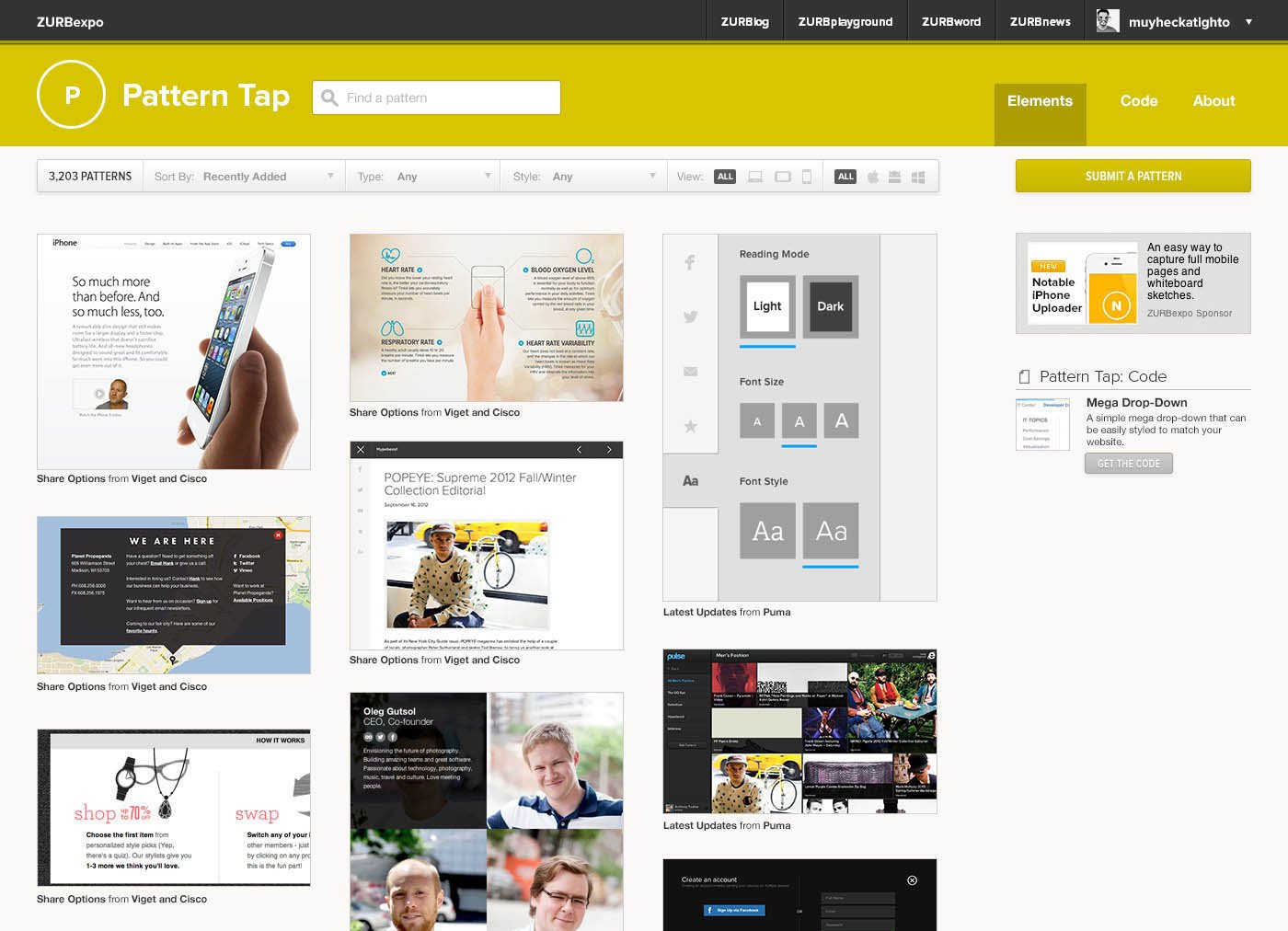
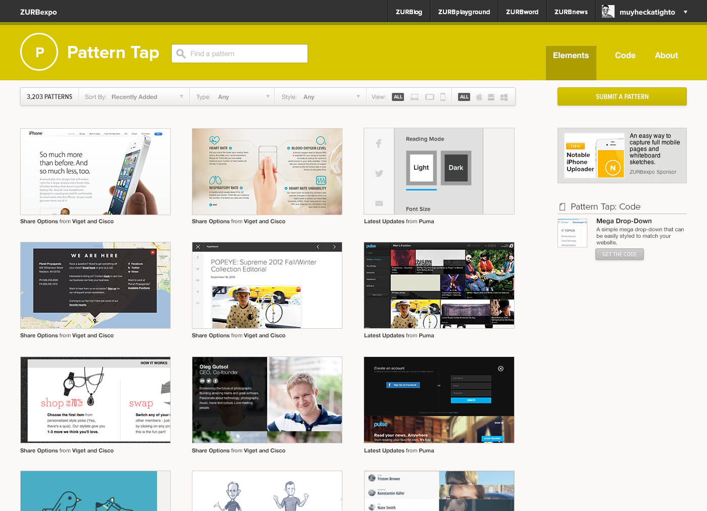
Pattern Tap Code will be the destination to find code patterns that work seamlessly into your site.
Bryan explained the other day how Pattern Tap fits into the larger aspects of our educational channel, Expo, and the overall larger business. As we mentioned, we wanted to expand on what Matthew Smith originally built. However, we didn't immediately redesign the site once we took over a year ago. We only did small tweaks at first.
Why wait?
We wanted to learn. Before we could start changing things wholesale, we needed to understand how everyone used it as a resource. That way we could build upon it. Our first goal was to seed it with content and be consistent about doing so. Since we acquired the site, we've added over 750 app and web patterns to its ever-growing library.
But our second goal was born out of the success of our Foundation templates. The canned HTML made it easier on designers to get started designing responsively. Seeing how it helped them, we decided that Pattern Tap had to evolve into a product that fit someone's workflow as well. We had to expand on what would be available as patterns — and the next natural step was code patterns.
It's great to not just see a finished site or app, but how would you be able to implement it? If we were going to fit within a designer's workflow, then we had to provide examples to answer those questions. After all, coding is as much part of design as the visual patterns.
But as we started to explore how best to do add code to Pattern Tap, we learned a few lessons that helped shape what we were doing.
What We Learned Turned Into Our Goals for the Redesign
1. Pattern Tap is a Reference Tool
Pattern Tap is a reference tool that lives in the Expo library. We had a few discussions on the best way to present it as such. We explored whether we wanted a Masonry-type layout, where each element could be a different height. But we came across a few problems:
- Heights don't vary that much. The most variation was from a vertical phone layout. Most of the elements we were tapping were horizontal and had similar ratios.
- It didn't feel like a library resource. It's not easy to scan items and see tiles if they are not lined up next to each other. That's why we modeled our thumbnails after the book code labels, and not the varying heights of the books themselves.
Early visual iterations of Pattern Tap where we tried a layout of varied heights.
We had to create a consistent style with our other Expo properties as well. Pattern Tap had to feel like it belonged to the same family — a resource that lived within the community.
Once we had the pattern, if you will, of how we'd present Pattern Tap as a library resource, we had to tackle a few more things.
2. Cross-referencing and Getting Rid of the Back and Forth
In the previous design, finding a pattern required that users go to a separate page to browse for a tag. Pattern Tap, however, is all about the browsing. We don't want you to have to go to another page. We want to keep people on the page. Which is why we put everything in a filter bar so you don't have to go back and forth.
The filter bar also helps users cross-reference styles with types. Previously, finding a login form was easy but finding one that was also flat was not. Now with the filter bar, it's possible. More than that, it encourages browsers to do so.
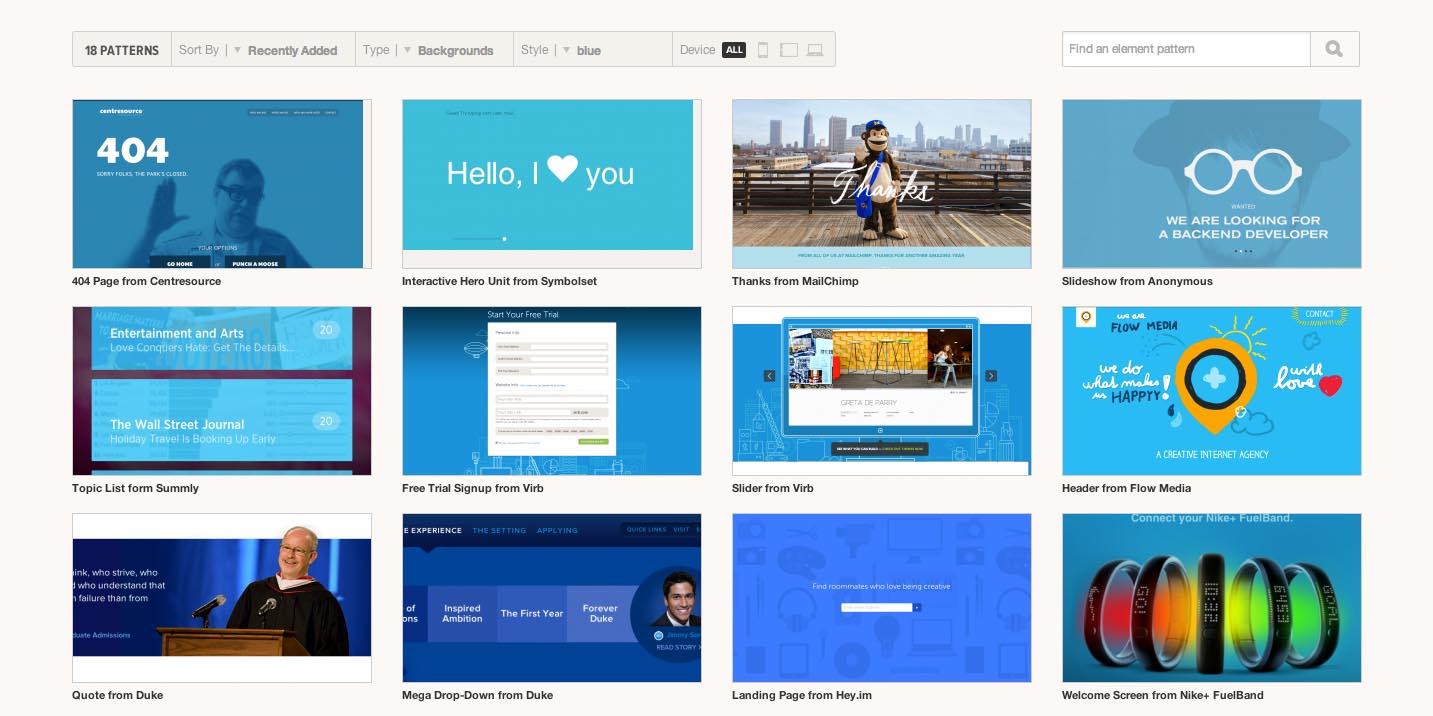
Much easier to find backgrounds that are blue
There's still a fallback. If you want to get familiarized with the different types and styles we have, you can still see the full list of tags by hovering on the Element navigation item.
3. Making Pattern Uploading Easier
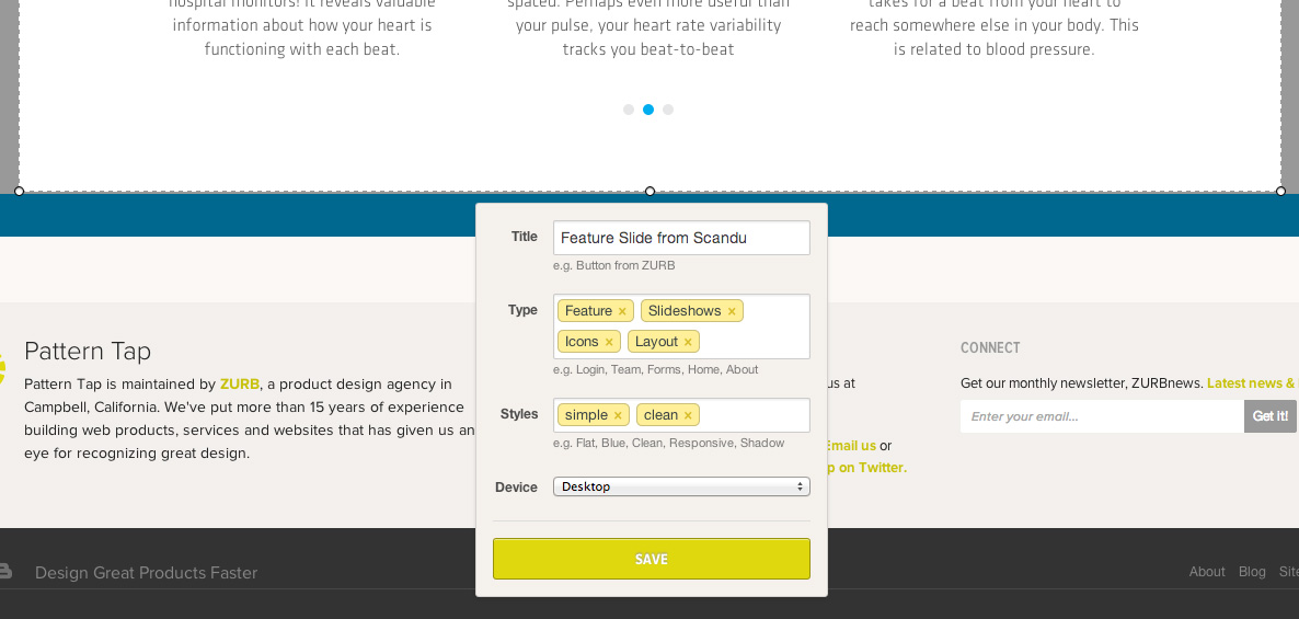
When submitting a pattern, you no longer have to add user tags.
You can still upload patterns the same as before, but we took out the requirement of the user tags. We learned that it was an unnecessary part of the upload process, especially since these are different for each user. You can still do your own tags — just go to "Saved Patterns" under your account. That way you still have the functionality, but it doesn't expose your user tags to everyone.
4. Reducing the Amount of Actions
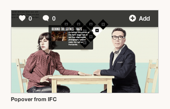
Like, comment, or add to your saved patterns. Simplicity is key.
When it came to "liking" patterns, we had two actions in the previous design — a heart and a light bulb. If it was great visual design, you'd use a heart. If it was a great idea, you'd use a light bulb. And it really just boiled down to "this is the one I like." So we consolidated that to just a heart, which translates as "I like this, thanks for the great design." And the heart as a pattern itself is universal and understood.
5. See Patterns from the Same Source

Wondering what else we've tapped from Desk.com? Now you can without having to search!
We wanted to even further cross-link patterns from a given source. Say you were looking at a pattern from a Google site. Then you'd also see what Google is doing across other properties, but didn't want to browse or search around. Now these get pulled in so you don't have to leave the pattern you're looking at and can easily decided if you want to select another pattern from the same source.
Not Just for Aesthetics
The changes weren't just for aesthetics. It was about creating a resource that designers could come back to again and again. This redesign is part of our ongoing effort to educate designers on what makes for good product design and Pattern Tap is an important tool to help us do just that. But this is only the beginning. We're be adding a few other things to help designers as well as making tweaks to the site.

