For a product designer, an interface is not just a collection of words and pixels. Everything we design is a potential study in human behavior. Understanding human behaviors and motivations can help designers create interfaces that people truly connect with. But being able to defend your thinking in a stakeholder presentation is another story.
Stakeholders may (wrongly) see our work as designer's whimsy, and it's our job to defend our designs with as much passion as went into producing them. What they need to hear is some solid proof that whatever we're proposing is going to have a BIG impact on the business.
Over the years we have learned many design patterns that help us streamline our process. And every pattern has its own purpose, rooted in natural human behavior. Lucky for us, human behaviors have been studied for millennia. There are hundreds of years of psychological research that, when used with purpose, help designers make deliberate design choices and provides solid proof to back them up.
We've been investigating in earnest these behaviors, identifying some 76, so that we could better use them in our work. Let's take a look at eight behaviors that you can wield in the next feedback session.
1. Attention
Your interface has a specific task — say book a flight or a hotel room — that you want users to accomplish. And while you may have other elements present, your users won't notice. They'll remain focused on the task at hand.
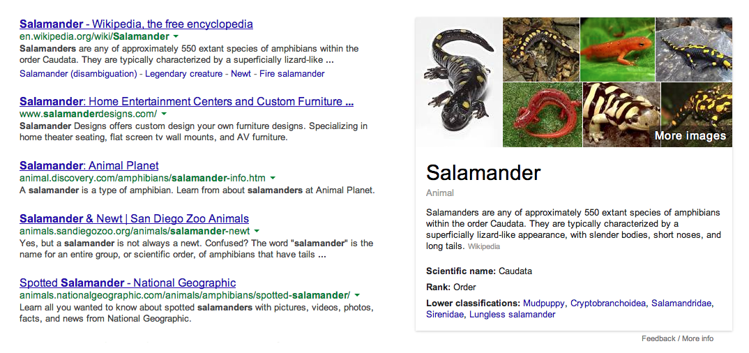
Google anticipates what the user is most interested in and serves up some extra info along with the search results.
How to Use It
When designing a goal-specific workflow, keep the peripheral content to a minimum and present only very relevant info. Otherwise, a user may get distracted and not follow through on the task. Articulate how you've considered what a user's most relevant need or interest is in your design. Highlight how the relevant information and certain functions aide a user in accomplishing a given task.
2. Achievement
Behavior can be reinforced through rewards, kind of a Pavlov's Dog situation. If a user's achievements are acknowledged, she'll be more likely to engage in activities. American psychologist Henry Murray was the first person to use the term in the late 1930s after recognizing achievement as an important source of human motivation.
How to Use It
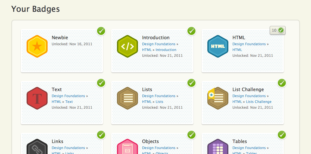
A common incarnation of Achievement is to use rankings, badges or status in your design. It's important to set goals that are specific and challenging, but achievable and meaningful at the same time. Don't present someone with a reward that's unachievable or a long way off — it will create low motivation in your users. By setting small goals, you can increase confidence in your user quickly and keep them coming back for the next carrot. Incidentally, using Achievement also helps the business gauge user engagement, an easy metric on which to follow up.
3. Bandwagon
Word of mouth is very powerful. Economists have known for years that people base their decisions on what they hear from friends or strangers. Same with digital products. Users who are on the fence can be easily swayed if they see other people enjoying a product. Angry Birds, anyone?
How to Use It
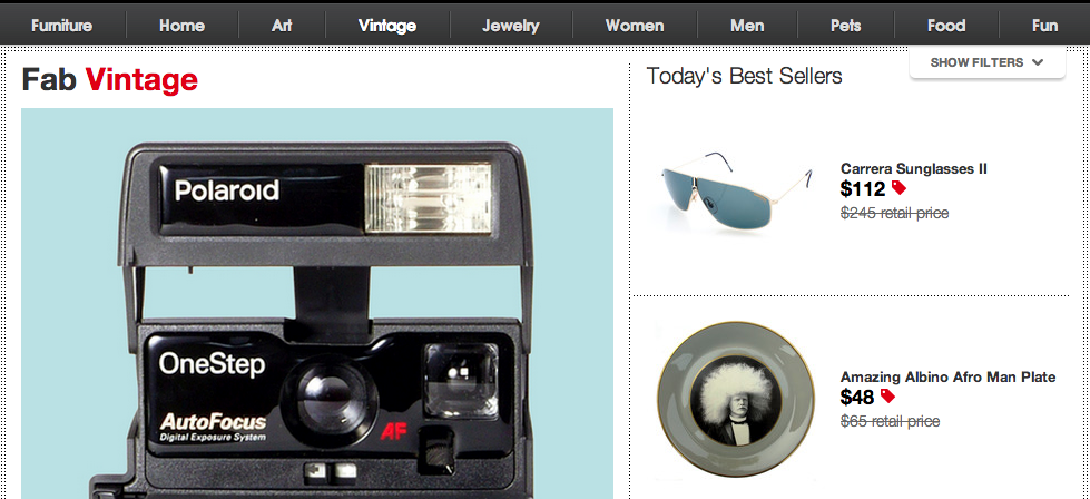
Showing potential users how many people are using your service or product and how much they like it could encourage your audience to follow the 'trend.' Social proof, which can be considered a motivator on its own, is another version of Bandwagon. Showing testimonials, number of followers can convince a cautious user that your product holds water.
4. Familiarity
When given a choice, people will always flock toward the familiar over the unfamiliar. How many of us immediately chose an unfamiliar, new product over one that we know is reliable and gets the job done? Or think of it this way: if you're a Coke drinker, when was the last time you said, "um — let me give Pepsi a try."

How to Use It
Give users a taste of your product to persuade them to buy. Getting in front of your customers — through advertisements, giveaways, free trials — will make your product seem more familiar to them. However, don't repeat your ads too much or you'll become background noise to your potential users. You can also connect to users who are already onboard with your product. The more you foster those connections, the stronger the trust you build with your audience.
5. Relative Value
People have a hard time gauging absolute value. It's also human nature to make comparisons. Users often compare products against alternative ones, using either on-hand information or other references they trust to help them assess the product's relevance.

Mazda shows a comparison of their direct competitors to help sway potential buyers.
How to Use It
Give your customer a comparison, any comparison. Comparing your products to competition will often make yours more appealing. Illustrate the different options to communicate how your product is a better value.
For pricing, provide premium and budget versions alongside regularly-priced products. This will likely steer their attention to the most desirable price point. You can also show the original price and savings when a product is on sale to give the customer a sense of value they're getting.
6. Recognition Over Recall
People have two types of memory: recognition and recall. But when it comes to your users, it's easier for them to recognize what they've previously seen or experiences rather than recall them from memory.
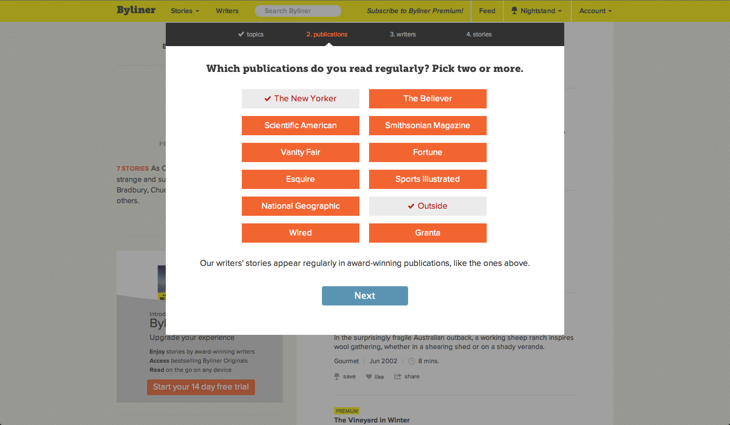
Multiple-choice or one-click options are easier ways to help users find what they are looking for on a site.
How to Use It
When trying to get more information about a user, don't ask them to write what they like. Instead, present a list of items that represents a certain category of data. Users recall much more simply clicking on data. It'll also help you collect a much broader pool of data whilst providing a fun challenge for the user.
7. Peak-End Rule
What do you remember from your last vacation? Likely some key moments. That's because people mostly judge past experiences by their highlights, either pleasant or unpleasant, and how those experiences ended.
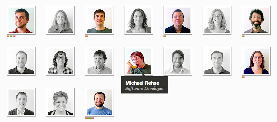
Unexpected hover effect on About Team page from Arc90 creates a memorable peak in the experience.
How to Use It
Create peaks and endpoints for users. Peaks can be the core values you provide or an Easter Egg that'll surprise your user. Endpoints can be obvious, such as completing an order, or subtle, like a friendly or funny registration confirmation page. In either case, give your user something memorable to latch onto during, or at the end of, their workflow.
8. Scarcity
The fastest way to get someone to desire something is to make it scarce. They'll want it more if they think it's in danger of vanishing for good — say a short supply or only available for a limited time.
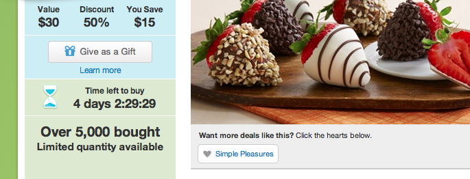
Time countdown on a Groupon deal makes the user more likely to act.
How to Use It
Scarcity could be time- or quantity-based. Highlight the amount of products still left or how it's only available for a certain period of time. Users will then perceive the products more worthwhile.
Get Into People's Heads
By using natural human behaviors in our work, we can get into people's heads with words and pixels. Solid proof can turn, what at a glance looks like, a trendy layout into an ingenious solution that can hold up against even the toughest critics. That, by the way, is Authority at its finest — a human nature of being more likely to act if we are presented with reliable evidence.
Digital product design plays on all the emotional and cognitive strings that offline products and marketing has been practicing since the beginning of products and marketing. Do you have a Buy-9-Get-10th-Free card to your local ice-cream shop, or have you ever fallen victim to a closeout sale? Then you've participated in Achievement and Scarcity in your own human experience. Wield these principals and you'll be able to better defend your design decisions in that next client meeting.


