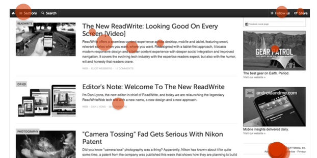
With all the exciting technology announcements (iPad mini's and such), you might have missed ReadWrite, formally ReadWriteWeb, rebranding itself and launching a new, responsive website.
ReadWrite recently announced Dan Lyons would take over as Editor-In-Chief of the new property, so their content approach will certainly be shaken up a bit. But what really intrigued us was ReadWrite's new design. A few months ago, they announced that they would be moving to a fully responsive site, replacing their iOS app. It was great to see the tech news outlet take a step forward in optimizing their content for all of their readers across multiple devices.
So this week, we're putting ReadWrite's new design to the Verify test, seeing if readers could navigate the new design. We asked three different questions of our @ZURB followers to basically find out if the site's design is truly optimized to consume content.
Is a Reader Able to Find Where to Read Stories Under a Certain Category?
First, we wanted to test to see if a reader knows where to go to read stories under a specific category or vertical. To do this, our instructions were: "Click on where you'd go to read 'Enterprise' stories."
Here are the results from the first test:
It turns out that most testers knew exactly where to go to find the content categories. Out of 40 testers, 60% successfully selected the 'Sections' part of the nav bar.
A basic eye test shows that indeed, most testers gravitated toward the upper-left hand corner of the design when making their selection. This design decision definitely bodes well for ReadWrite in the context of discovering content.
Is a Reader Able to Find Where to Contact ReadWrite?
Occasionally, a reader may go to ReadWrite's site to see where they can submit a story tip to the publication. Do readers still know where to go?

Good news here: Out of 36 total testers, 29 of them successfully selected the 'Contact Us' link in the bottom right-hand nav.
Finding this, however, may actually be tougher than this screenshot makes it out to be. A reader has to scroll down the page a bit for the right-hand bottom nav to show. Assuming a reader naturally scrolls down to find the Contact link, it's apparent that the design enables someone to easily find the right place to contact the tech publication.
Does a Reader Know Where to Go to Follow ReadWrite on Their Mobile Website?
We were satisfied with ReadWrite's desktop presence, so we wanted to shift our attention to their responsive website on mobile.
Does a reader know where to go to follow ReadWrite on social networks? The mobile web UI is slightly different from the desktop, so we were interested in seeing if reader knew where to go.
The results were nothing short of interesting.

Only 50% of our 32 respondents to this test ended up clicking on the right part of this interface. The + button, first to the left of the share icon, was the correct selection in this instance.
The good news here is that the majority of the clicks ended up being in the top nav bar (only 4 testers clicked outside of this area), so testers realize that the social networks are likely somewhere within this area. However, ReadWrite may want to experiment to see if they can make their social properties clearer to their readers on the mobile web.
Our Conclusion
All things considered, we really like the new ReadWrite design, but there's certainly room for improvement with the mobile view. However, it's nice to see the site take a bold step into the responsive realm. Not only that, the design puts content front-and-center, and is much cleaner than the previous design iteration of the site. It's clear that readers know where to go to read stories under choice verticals as well as getting in touch with the publication.


