The newest Digg redesign is among the most-anticipated and biggest launches of the year. Earlier this month, Betaworks acquired what was left of the property for a mere $500K. At the time of the report, Betaworks said they planned to 'build Digg for 2012,' but could it really be done?
Well, the new Digg launched last Tuesday night and, yes, Betaworks did a solid job with the redesign. The new site is much more visually-driven rather than list-driven like its previous version.
While the release has gathered plenty of attention, it hasn't come without critics.
The redesign looks very nice on the surface, but is it something users can understand and easily use? We ran a series of Verify tests to evaluate the new site.
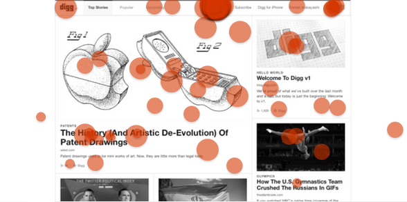
Does a user know where to go to Submit a Link?

Our first test examined whether a user understood where to go to submit a link - one of the most important user actions.
It turns out that most users know where to go - 204/247 testers (82%) know where to go to submit a link. There was no real correlation between any of the missed clicks, which leads us to believe that submitting a link is a very straightforward process in this new design.
It took a user only 6.4 seconds to find the link.
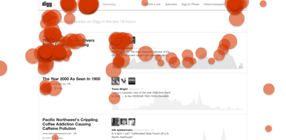
Does a user know where to go to view social shares for the 'Most Popular' story?

We were interested in learning about whether a user understands where to go to find the number of social shares on a story. The most popular story, 'This Is How Olympic Divers Really Look While Diving,' was the target story in this screenshot. From the click map, it appears that most people ended up in the right general vicinity.
When Digg first emerged, there were few major social networking sites to compete with - but given the new landscape with many places to share, the newest version includes actual social share counts. These are somewhat hidden: Users must scroll and mouseover the graph icon to get Digg counts, Twitter tweets and Facebook Shares.
Quite a few users were led astray by the 'Popular' tab in the top navigation, and the social media icons in the upper-right hand corner also tricked some users. Since sharing is central to Digg's strategy, we figure it will only be a matter of time before users catch on.
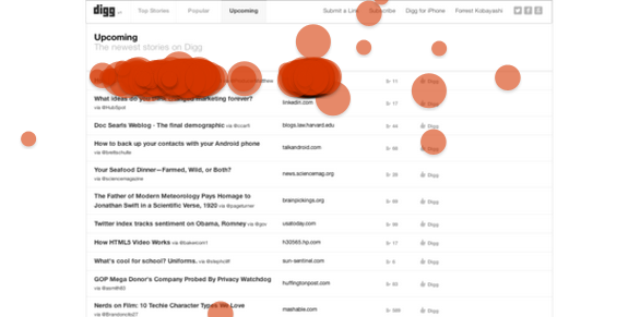
Does a user know where to go to read a story on WashingtonPost.com?

Of course, you wouldn't go to Digg just to browse, right? Inevitably, there will be a time when you will want to click through and read a story. So do users know where to click to do this?
We took a screenshot of Digg's new 'Upcoming' portion of the website - and to our surprise, it appears that users were somewhat torn between clicking on the story title and clicking on the website name.
If you are on the site, it's clear - so we admit that this screen itself is functional (you can't click on the website name, but you can click on the title). Digg possibly could improve by changing the formatting of the source page.
Only 10/241 people (4.15%) missed one of the two targets altogether, so this design, despite the minor confusion, does work here.
Does a user know where to go to subscribe to the Digg newsletter?

Even the most active Digg users will need to take a break from the site every now and then, so do users know where to go to sign up for Digg's newsletter?
It turns out that yes, most users correctly identified the right link to click. Digg's Subscribe link is in the top navigation between the 'Submit a Link' and the 'Digg for iPhone' links.
Some users were led slightly astray by the social media icons on the right-hand part of the top navigation, but a total of 218/241 (90.46%) users got this one right. It took the average user 5.69 seconds to find the link.
Conclusion
We were all very excited for Digg's acquisition by Betaworks, but we were even more excited to see their ambitious new plan for the site come to life. As you can tell from these tests, Betaworks has done a great job at bringing back what was best in Digg's early life - crowdsourced curation of the hottest content on the web.
Do you like the new Digg redesign? Let us know in the comments.
UPDATE: Paul Tamaro notes that profiles from the past version seem to be broken, directing to a 404: Not Found page. It will be interesting to see if Betaworks adjusts this so users can return to their familiar (and possibly bookmarked) sites.


