Imagine for a moment that you have to showcase the differencs between two images. What to do? You could simply put the two images side by side. But you can't really catch what changed between them. We came up against this problem ourselves and we knew there had to be a better way to bring design changes into focus.
The Spark
It all started a few weeks ago when we upgraded our screen capture service to snap more accurate screenshots of websites. While writing up the blog post on what we did, we thought it'd be great to do something dramatic to illustrate the changes. We decided to use a little javascript to toggle between the before and after screenshots. It worked ... sort of. It didn't provide the clear picture we wanted. We were left with the same problem — how do we actually show the differences?
We asked around the office. Alina, one of our Design Leads, suggested we look at Canada Goose's website. They used a slider that showed the differences between counterfeit goods and the real deal. Eureka! That sparked the idea that we could do something similar, but responsive. After all, it had to work across all devices. Thus was born TwentyTwenty.
Here's what we came up with for the blog, in action:


If you're on a mobile device, you can use your finger to easily slide between the two images. Go ahead, give it a whirl.
The Process
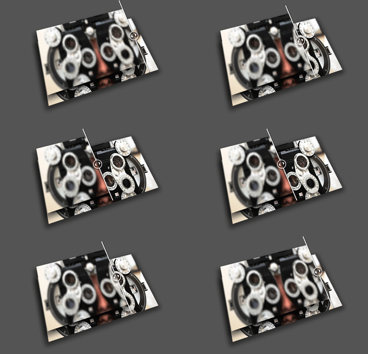
We essentially stack two images on top of each other then selectively allow part of the bottom image to seep through to make this all work. This snazzy graphic shows you what happens:

The bottom image is the "after" picture and the top is the "before". The user has control over how much of the "after" to show. Think of it this way: Let's assume you have two images stacked on top of each other with 800x300px dimensions. If the slider is adjusted to sit 200px from the left, then the CSS clip property is used to crop the "before" to 200x300px. This allows the remainder of the "after" to show through.
How it fits in
We're huge advocates of responsive web design here at ZURB and have a strong desire to push the limits of the web. TwentyTwenty is part of our commitment to create interactive widgets that work on both desktop and mobile devices. That's why TwentyTwenty also works with Foundation, our framework for building responsive websites and applications. Head over to the Playground page now. And, yes, the cats on the page's header image are interactive.


