 We're big fans of giving contextual feedback, and making it as fast and easy as possible. So today we're proud to announce Axe, a free tool for giving webpage feedback using your iPad.
Similar to Bounce, Axe asks you for a URL, and then grabs a screen capture of that webpage for you to add notes to. Unlike Bounce, Axe allows you to add your notes directly to the page, using touch gestures on your iPad.
Scribble to Axe
 The inspiration for Axe was the visceral act of taking a sharpie to paper and forcefully scribbling out the parts you don't like. We wanted to recreate that experience in a way that can easily be shared, and won't run our ink supplies dry.
We first tried to build this interaction using the mouse, but the connection between moving the mouse up and down and the scribbles appearing on the screen was lost. The fun was lost, too. We needed to be able to actually touch the thing we were removing, so we ended up making this a tablet only application. It's web-based so you can jump right in without having to download anything.
The interaction is simple, take your finger and scratch out things you don't like. We use a fairly thick line (40 canvas units to be exact), so that you can redact entire headers with a single swipe, or kill large images without excessive movement. This worked great for those use cases, but when we tested Axe by handing an iPad to someone who had not seen Axe before, one of the first things they tried to do was draw. Draw arrows, smiley faces, sad faces, swear words, you name it. And this was pretty clunky with a big fat line.
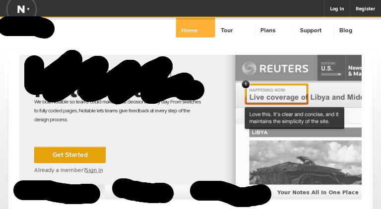 We wanted to keep the options to a minimum, but if people were going to draw, we should at least make it easy. So we added the ability to toggle the thickness of the line that is drawn, a broad line for axing stuff, and a fine line for free form drawing. We still kept the broad brush as the default, because the point of Axe is, well, axing things. But if you need to add a drawing to better communicate your feedback, go ahead and doodle away.
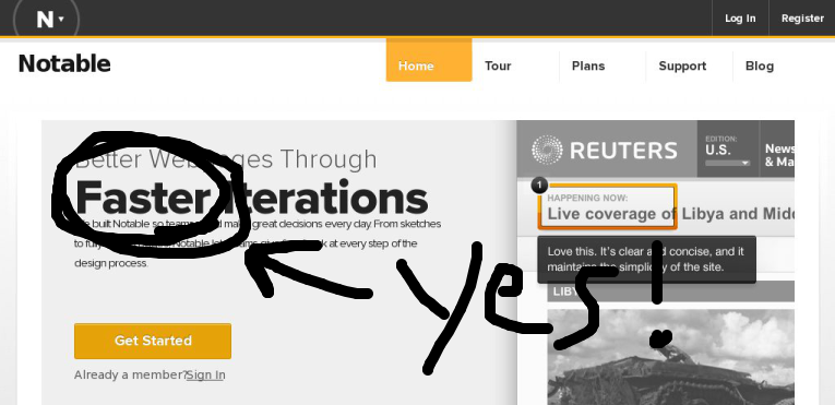 By simply taking your finger and drawing on the webpage you can communicate with more emphasis and emotion.
Tap and Hold to Comment
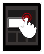
Blacking things off on a page is all good and fun, but the feedback is not very valuable to others unless you provide a short explanation as to why these things should be removed. Writing notes with the thin brush works if you want to be dramatic, but it's not practical for longer messages, or just explaining something without using a lot of space.
There was some discussion as to what gesture should be used to add a note. Some ideas included double tap, spread (opposite of pinch), and double tap and hold (keep reading; we can explain). We started with the double tap because it felt good to tap twice and have a note pop up. The problem with double tap was that we couldn't coerce Mobile Safari to give focus to the text area in our note. The reason being that Mobile Safari only allows JavaScript to give something focus from a click handler, and since we were binding to touch events, our calls to focus were being ignored.
A Very Technical Discussion of Click and .focus() in Mobile Safari
Buckle up. It gets more complicated from here. Binding to click handlers in Mobile Safari is problematic because they wait roughly 300ms before firing. They are waiting to see if you tapped twice, in which case the interface will zoom in, since double tap means zoom in. Never mind if zooming has been disabled for your web page, the delay is still present. This makes it impossible to implement a double tap handler using click events, so unless we were willing to give up on auto focusing the note, the double tap gesture was out.
And give up we were not willing to do. After some random experimentation, we found that by inserting the note after a double tap, and then keping our fingers down for a moment, a click event was being generated on the note we had inserted. And thus the double tap and hold gesture was born. The magic of double tap and hold is that the callback from the second touch event is fired before Mobile Safari starts to detect the start of a click event. So imagine as your finger is coming down the second time, right before it hits the screen, a note element is created under it. Then by keeping your finger down on that element for the required 300ms, you generate a click event that we can use to focus on the note text area. Great success! Sort of.
After getting this to work consistently, we proudly handed Axe to someone who hadn't seen the app and told him to go ahead and double tap and hold to add a note. After getting a blank stare, we demonstrated the gesture. After seeing it, he was able to execute it about 60% of the time. A couple other people confirmed that the gesture was difficult to execute, unintuitive, and inconsistant with other gestures on the device. No sugar coating it; we had a real loser here.
At this point we had to make the hard decision to give up autofocus in favor of a better add note gesture. Double tap still felt good, but the timing could be a little tricky, and it did not borrow from any native gestures on the device. Ultimately we decided to tap and hold because it was somewhat consistant with the native tap and hold gesture (to bring up secondary actions), and it was dead simple to execute. Just put your finger down and wait for the note to show up. You then need to tap on the text area to bring up the keyboard, which isn't ideal, but that's mobile web development.
Two Fingers to Scroll
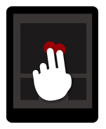
This last interaction is much easier to explain. Native scrolling is done by taking a single finger and swiping, but in Axe we use that interaction to let you draw. If you are viewing a webpage on Axe in the landscape mode, you can still use a single finger to scroll by touching the margins of the image. However, in portrait mode we use the entire width of the screen, so if you want to scroll using the image of the webpage, then you need to use two fingers. A simple gesture, but if you really hate it, just rotate your device and scroll outside the margins.
Return of the Double Tap
When scrolling down a long page, it can be inconvenient, to scroll back to the top if you want to switch between brush sizes, so we added one last hidden gesture. You can double tap anywhere on the image to toggle the brush size. Just one last little touch to make giving feedback as easy as possible.Save and Share
After you've axed out all the parts of the page that you don't like and added notes to explain your ruthless editing, you need to share that feedback. Clicking the Save and Share button in Axe will open up your email client and let you quickly shoot a link to your feedback to whomever deserves it. While you can only axe webpages on a tablet, you can view the feedback on any device.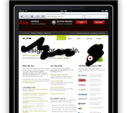
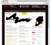
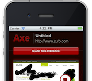 Different devices deserve slightly different treatments. Take the share mechanism for example. Copying and pasting a link is a pain on tablets and phones, so we stuck with a button to email the link on those devices. Phones have much smaller screens then tablets, so we use a full width button for sharing on phones. Rather then serving different pages based on the user agent for different devices, we're using media queries to target different screens, and use that in conjunction with classes to indicate on what devices different elements should show. Pop open the markup and take a look if you're interested.


