Cards within design layouts have gained immense popularity over the last several years. Companies like Google, Facebook and Twitter who have millions of users that use their products every day have leveraged this popular UI component within their interfaces. Not surprising since, cards are a perfect response to the rise of responsive design. They're self contained units that can be moved, shuffled and mixed with different content types. They respond easily on different screen sizes, from single columns on mobile devices to multi-column on larger devices, and can move independently around the web.
At ZURB we've found cards to be a great solution within our client work and have been keeping close tabs on their use around the web. Google has written pretty in depth about their usage within their Material Design framework as well as some great content from teams like Intercom. From our 100+ card based projects the last couple years we have, however noticed some pitfalls when designing with them. Here we'll cover 5 of the most common mistakes we see designers make with card based UI:
1. Large visual gaps from different content lengths

In a perfect world, our content would be as neat and tidy (and consistent) as it is in our Sketch files, but real world content isn't perfectly uniform. Titles are longer, descriptions vary and (as much as Apple wishes) names aren't always 4 letters long. When cards are placed in a grid at larger screen sizes we can often see large gaps that interrupt flow. This isn't to say whitespace is frowned upon, but inconsistent whitespace can limit the density and make it difficult to scan cards.
There are three things we ask our designers to consider when this issue arises. First we look to see if the data makes sense when truncated. Will titles or descriptions still make sense when data is capped at a specific character count? Will the user be losing vital info? Secondly, we see if cards will make sense in a masonry layout. This works if content doesn't need to be tediously scanned, but instead when users can just peruse the content. Lastly, we see if we can shift content inside the card to make it work on one column on all device sizes. This allows cards to be as short or tall as needed and often allows us to keep information dense within the site.
2. Too many cards visible at once

It's always tempting to want to use the entire space of your screen, especially when building something like a dashboard or web app where users may appreciate seeing it all at a single glance. This, however, can become an issue with cards as too many cards within a grid, or on screen at any given moment can become overwhelming and can cause users to strain when scanning.
Much like text line length, we want to think about how much content a user can reasonably take in at any given moment and how far a user's eye can scan horizontally over the screen before it loses it's place. We suggest setting a max-width on your cards container to limit this content overload and while there's no magic number for how many cards across is too many, some basic user testing may help you discover this for your own use case.
3. Too many actions at various areas of the card
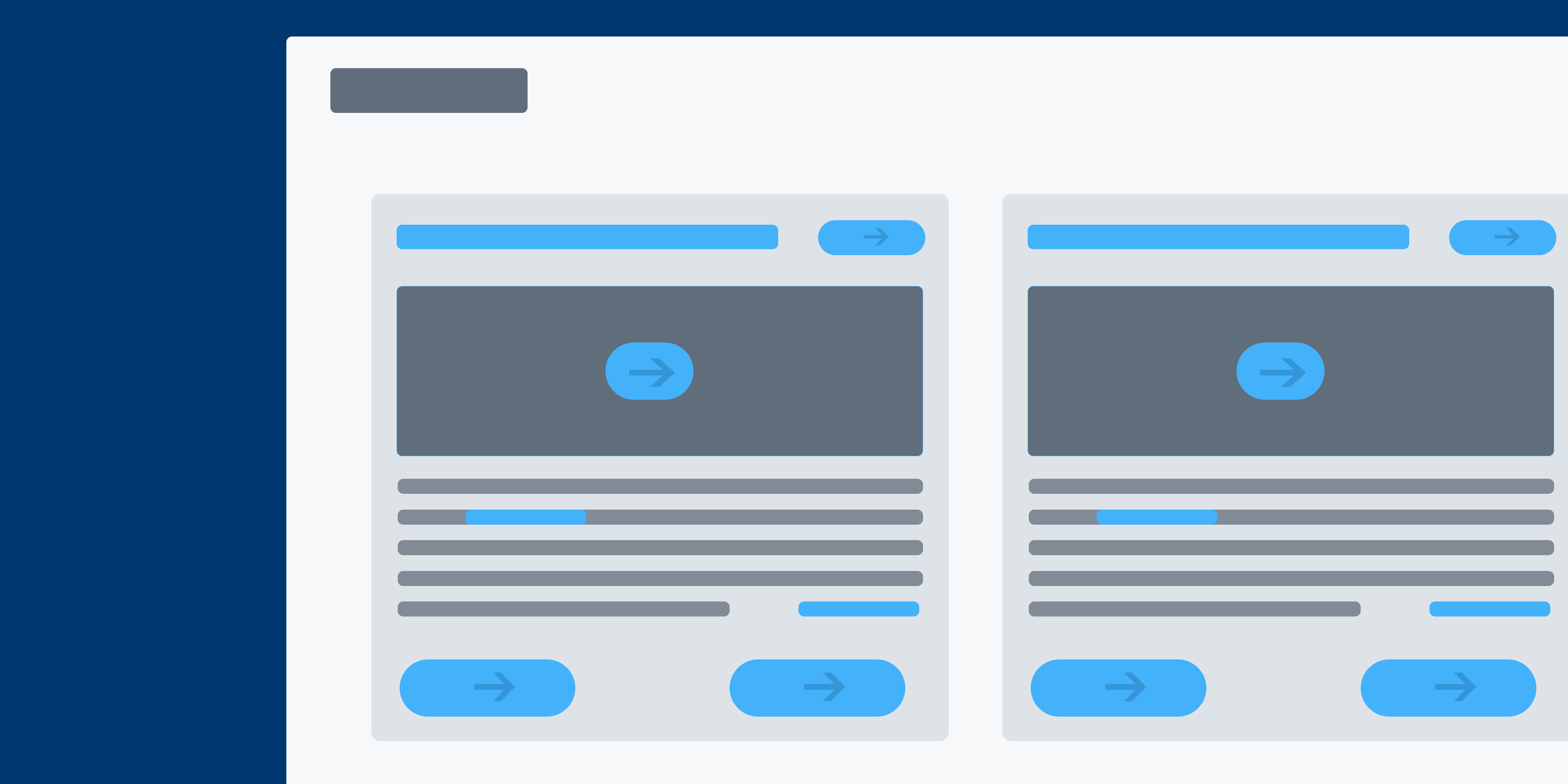
One of the most valuable things about cards is how well they work as bite sized chunks of content that are gateways to additional info or actions that users can take. This means that it's sometimes tempting to pack cards with tons of actions in every area of the card. A gear in the top left, or a trash can on the top right may seem like a good use of space, but turning every aspect of the card into a link can be be more confusing than helpful to your user.
This link overload is often at the behest of a client or project owner and it can sometimes be easier just to add the actions rather than fight the battle. We encourage our designers to think through what actions are necessary on any given level and to potentially group the actions by importance or type. This allows us to unify the few key actions to their easily found spot at the bottom of each card.
4. Overloading cards with content

Cards do a great job of breaking down large amounts of data into small digestible bits. They are especially fantastic for getting a quick snapshot of a project, a document, or a news story, but can sometimes tempt us to continue piling on content. Adding an Image, a button, a description, a chart, or a graph can seem like a helpful way to give users everything they're looking for, but more often it ends up overloading their ability to focus.
Outlining your primary content, secondary content and tertiary content is a great way to keep the card focused and allow users to take action to see more content. To do this we must know who is using our product and why they're coming to this page. We can then help rule out outliers and trim our card data to the minimum users need to see before they choose to take action and drill down.
5. Forcing a visual when one isn't needed
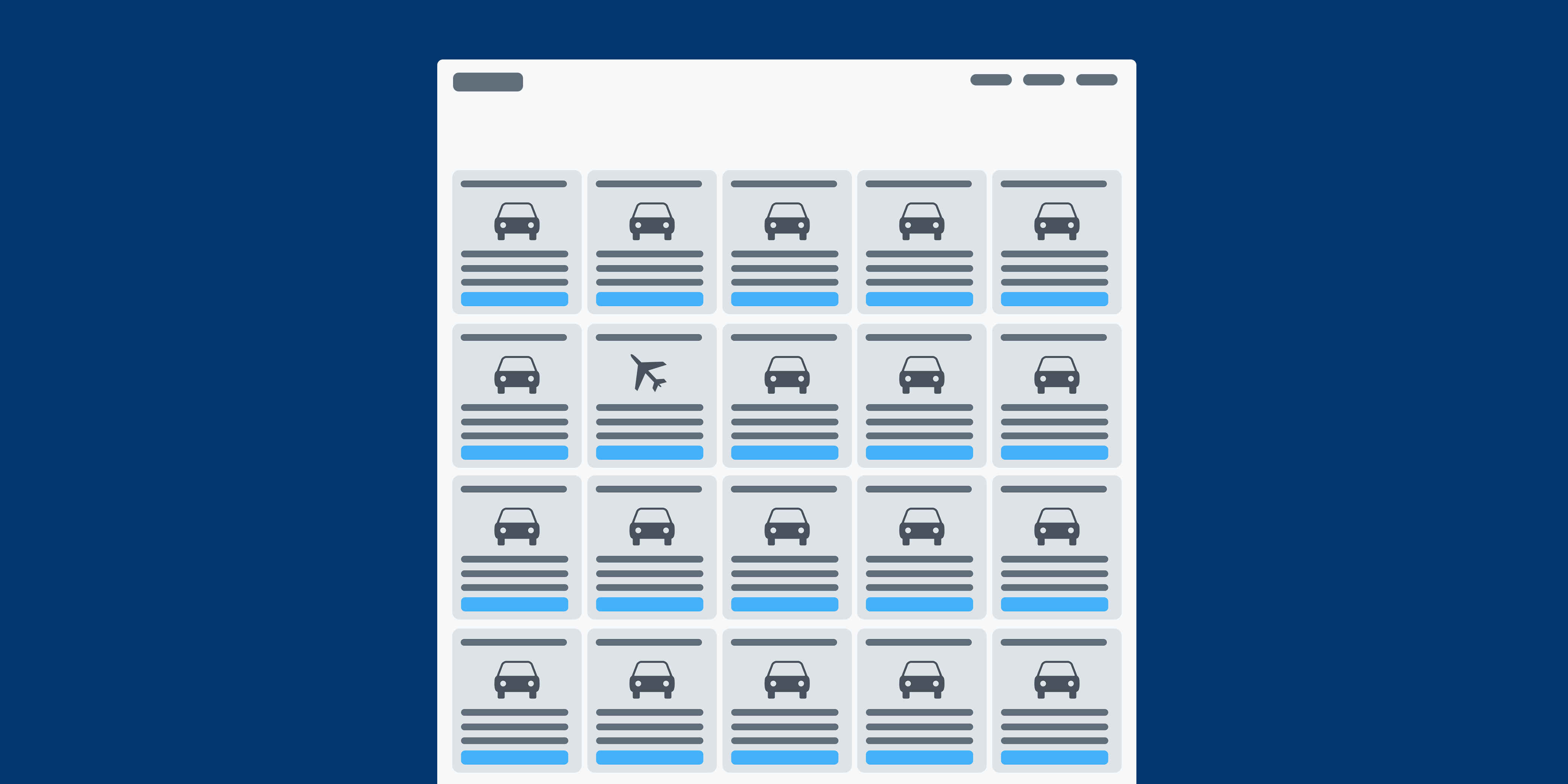
We've all seen pretty Dribbble shots with amazing photography, illustrations or icons in the header of a card. This makes the card feel visually striking and can split up some of the typographic content, but sometimes our cards' purpose doesn't have a visual that is part of the cards' primary reason for being. We leave a gray place holder in the wireframes and assume we'll figure out it's purpose when we start visual explorations.
When our designers add an image onto a card we often ask for the 'why'. Why does this need an image or an icon? Does this help the user better find content they're looking for, or will it simply become visual noise as users leave the default icon? This is usually a symptom of poor understanding of composition and needing an image or icon to balance out the cars, or separate the content. A great way to combat this is to do some typographic explorations and work with content order and hierarchy till the cards look balanced and clear.
Play Your Cards Right
Card design has been a welcomed force on the web and the ZURB team has been embracing them in our design work for years. We've explored them in websites and web apps in every industry from finance to biotech and have always found them to be a flexible part of a well oiled design. We've even noticed that In recent months as our designers have been coding within Foundation 6 that there has been an increase in projects with card components built from the ground up. While there's nothing wrong from coding a component from scratch, the team has taken the most solid use cases for cards and has added them into the forthcoming Foundation 6.3. This means cards will be even easier to use in your next project, but just make sure you're not falling into any of these pitfalls while using them.
We're testing out Cards in the Foundation 6.3 Release Candidate now with a full release coming December 15th!


