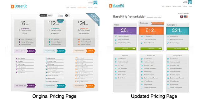
Our friend Paras Chopra of Visual Website Optimizer published an interesting case study about Basekit (who is also one of our customers). The Basekit team wanted to increase conversion on their pricing page. They decided to create a new design to do a better job of motivating people to click the buy button.
Without looking ahead, take a look at the look at the screenshots below and answer this question: Which version created more clicks to the buy page?

Whenever we ask this question during our talks, we get a mixed response from people. As it turned out, visits to the buy page from the redesigned pricing page increased 25%. Why is that? There are a few specific details that were responsible for this. Let's take a closer look:

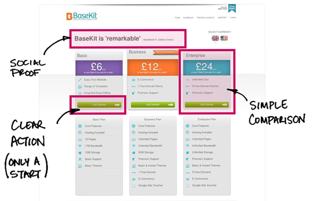
1. The social proof from real customers above the pricing page speaks a great deal about the product. It motivates people to click the buy button.
2. The pricing plans are easy to compare to one another. Using color with consistent text spacing above the buy buttons makes it easy to compare the choices and pick one. The older design with different button colors makes you question the differences between the plans more.
3. A clear call to action on the updated pricing page helps as well. 'Getting started' doesn't mean you're investing your life into the tool, it's only a start. The old pricing page had the 'sign up' call to action, which is asking for a bit more commitment from the user.
The tips above help illustrate how Basekit was able to increase conversion, but this does not mean that the same exact changes will help your pricing page. You might need to use different colors, different calls to action or a different layout all together. The main takeaway here is that these are some of the patterns that you'll want to pay attention to when trying to improve your conversion. It's never too late to pay attention to small details like these. As we mentioned before success is in the details.


