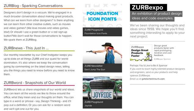
This week, we relaunched our ZURBexpo.com to push the newest content front and center. In December, we threw up a rather ho-hum, static page because we needed to get something up temporarily when we incorporated all of our publishing efforts under one umbrella. Check out the old page:

OK, we admit it, we punted on that one. But the page wasn't a priority for us at the time. Nevertheless, the page we put up was static. Newly published material wasn't being changed out as often as it was being published. For instance, there was nothing on the page to show when a new blog post went up. All in all, it wasn't a hub where people could go again and again to see what's new with those properties. It also didn't feel as if it belonged visually with the other properties that make up ZURBexpo.com:
- ZURBlog — where we share product design tips, tricks, lessons learned and ideas.
- ZURBplayground — where we share our experiments such as JQuery plugins, CSS3 buttons, stencils and apps to make it easier to design great products.
- ZURBword — where we share quick design concepts and our design methods
- ZURBnews — where we keep in touch with our family of thousands of passionate hackers out there in the world
When I came aboard in February, it was decided to make an updated ZURBexpo.com a priority and pushed forward with a complete redesign. And I was put to work to come up with the new look.
The Concept Isn't More Valuable Than The Content
One of the earliest ideas that I came up with was to capitalize on the concept of an expo, literally. Sketches were done inspired by old World's Fair pictures and other similar exhibitions. An expo meant fun and exploration, and we thought we could carry that through to the Expo page.
A few of us, including myself, were quite fond of the fun, interactive aspect that the concept could bring to the page. One concept had a wheel that visitors would be able to manipulate to go from ZURBlog to ZURBplayground to ZURBnews to ZURBword. While another had a series of circus-like posters that would rotate out of the latest from each of the properties.
But Bryan made a good point about the concept — it was less important than the content. The content should be front and center. In other words, the concept didn't have tremendous value, but the content did. So the content should really be the 'hero' of the ZURBexpo story. With that, the World's Fair exposition was abandoned and we concentrated on something that was more visually aligned with the rest of the properties.
For A Few Iterations More
For our first take, we still tried to include a World Fair theme. But the content ('the good stuff') was confined and and didn't have the spotlight it deserved. Check it out below (click for a larger image):

Our next round of iterations explored a pin board-style page, where items would look as if they'd been 'pinned' to the page. The feeling we were going for was 'Look at all this goodness!' but it was more of 'Oh my, what should I be looking at?' They had to hunt for the latest blog post. In other words, the content was lost in the shuffle. Click the image below for a larger image:

Another idea was to go back to the idea of fun and do something that was visually similar to ZURBword's main page with blocks of content that would constantly shift. Click the image below for a larger image:

The problem with that idea was that it didn't allow visitors to easily select the property they want to go to directly. But when it comes to updates, not all the pages are equal. ZURBlog gets updated daily. ZURBplayground is our most popular, but it isn't updated as frequently. ZURBnews gets updated monthly. ZURBword gets updated periodically, but not as much as the blog. It can be a challenge to balance all those properties. So we eventually moved away from the idea.
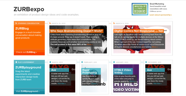
However, the blocks of content stayed through are next iterations before we came to the almost-final design. Click the image below for a larger image:

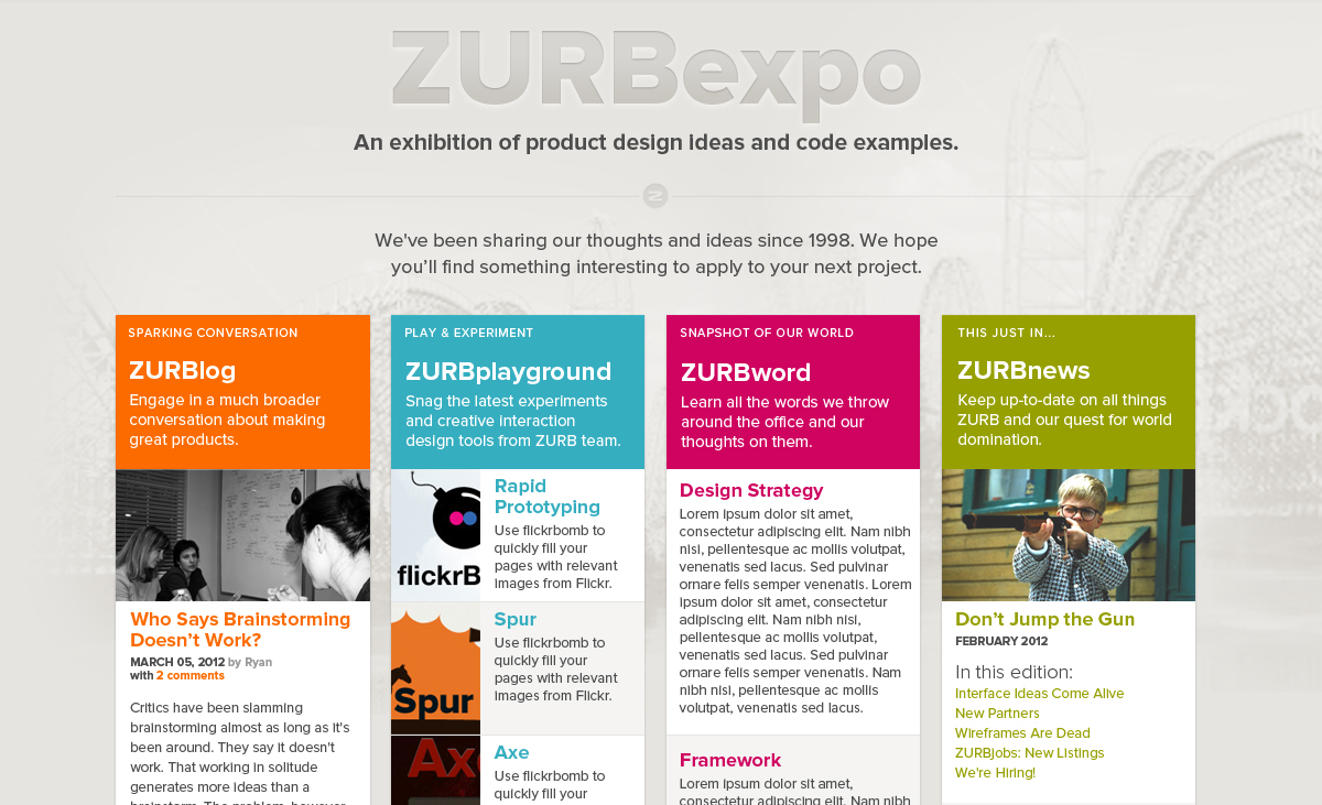
We also varied the sizes of the boxes and the amount of boxes so they were associated with a particular property. For example, ZURBlog has two long rectangular boxes while ZURBword has one rectangular boxes followed by two smaller boxes. Another way we differentiated between the properties was by using the colors associated with each particular one, such as orange for ZURBlog and blue for ZURBplayground.
The last iteration came to aligning ZURBexpo with the overall ZURB brand, which meant cleaner, streamlined graphics and simple overlays. That's where we landed. And here is the final design (click for the larger image):

Built with Foundation

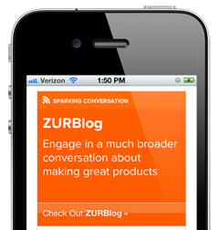
Since ZURBexpo.com was built with Foundation, that meant the design would look good on smaller devices, such as a smartphone. With Foundation's fluid grid, the content easily stacks down and allows you to scroll to each of the four properties.
With this final design, we had something that had the content front and center where it wasn't buried behind a concept. Not only that but it better matched with the other properties in terms of visual language. More importantly, this page better accomplished being a hub to all our ZURBexpo properties than its predecessor.
Check out ZURBexpo.com »