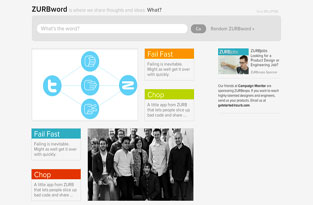
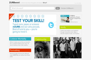
Remember how yesterday we told you about refining your designs in-browser quickly? Well, that was only part of the story ... really, the tail end of the story of how we used Foundation to code up a prototype in the browser for our new ZURBword front page. Take a look at our old page:
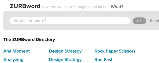
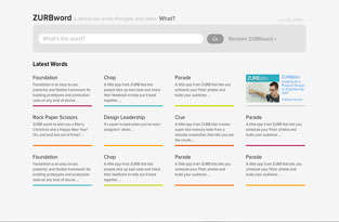
As you can see, there wasn't much to look at. It was nothing more than a directory, a list of words with not much going on. We wanted something a bit more eye-catching that would encourage people to click around and check out our thoughts on some hearty design concepts. So around November last year, we started sketching out some ideas to take the site to the next level.
But did we want to take those ideas and put them into Photoshop? Or did we want to go straight to code, designing in the browser? A lot of designers debate whether they should design in browser or not.
However, the one big advantage to prototyping in the browser is that it's faster, trimming off several steps in the design process, especially if you already have an established visual style. Since we wanted to get the new ZURBword up as fast as possible, we decided to prototype it in the browser.
Getting It in the Browser
We started playing with a few ideas, trying to figure out what would actually work. Take a look at some of our early ideas below. Click on the images to see a larger image.
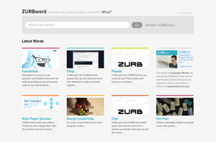
Here we lost a bit of focus on the content. There was too much line work going on and everything felt too structured and boxy. Overall, it felt too much like a beefed-up directory. So out these ideas went and it was back to the drawing board.
Playing around with the lines and images, however, we came up these next set of images. Take a look (click on the images to see a larger image):
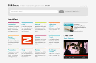
The design on the left, however, felt too forced, an island of stuff in a sea of text. The one on the right broke things up, which was kinda awesome. But there was that darn line problem again. Everything felt trapped, contained too much. However, we played even more with the blocks of content seeing where it would take us.
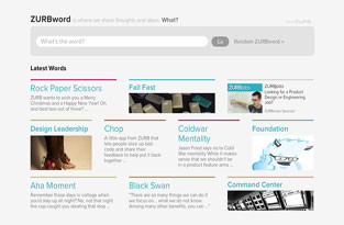
Our exploration led us to the designs below. Click on the images to see a larger picture:
In the end, we did something like 10 iterations to get to our final design. But we weren't quite done yet.
Refining Our Design with the Inspector
As we said yesterday, we refined our designs by opening up the Chrome inspector. In less than five-minutes, a group of us, including myself, were able to quickly critique the design and suggest changes, which the inspector let us see instantaneously. We were able to change the background from white to gray and even add a drop shadow to the boxes.
We also reversed engineered Foundation to add a couple more columns on the side for wider screens. One other nifty touch was having the images rotate each time you land on the front page.
With those final changes in place, we were able to launch shortly after that. All in all, it took us a few weeks to get the new ZURBword up and running. And all thanks to in-browser prototyping.
