ZURB has, at any given time, between 12 to 15 clients. On average, we end up creating wireframes for probably ... um, 90% of those. It's a lot of wireframes, roughly 2,200 a year between the entire team, and not counting internal projects. Yeah, you could say that wireframes are important to us.
We've even written about wireframes before, including why we wireframe at all. We've also written about some of the tools we use, especially the very excellent Omnigraffle (read more about Shared Layers in Omnigraffle and Omnigraffle variables). However, we've seen a tectonic shift occurring in how we wireframe, in large part because of Foundation, realizing that we can't wireframe the way we used to as designers.
Traditional Wireframes Are Dead
Or as close to dead, as it makes no difference. Here's the problem with traditional wireframes:
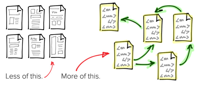
- They give no sense or insight into flow.
- They have to be created at various different screen sizes to account for how customers will actually see them.
- The client won't see them in their native element. The context is wrong.
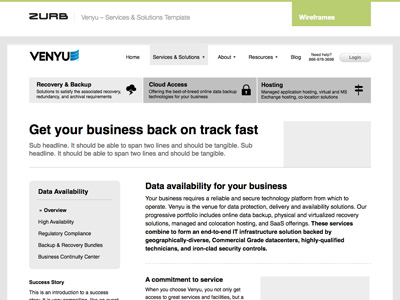
 A recent hi-fi wireframe we created for Venyu
These aren't new issues with wireframes, and there's a few ways around them. You can link wireframes together into a flow using something like Powerpoint/Keynote or just image maps in HTML. You can make wireframes for desktop and phones and hope that that's enough to get a good idea of how something will work. And you can try and make wireframes look and feel like the way they'll really be seen. But all of that is half-assed at best. We need some new hotness.
Coded Wireframes FTW
For several of our recent clients, we've been creating what we call coded wireframes. The idea of coding up your wireframes isn't terribly new, there've been rumblings about it for a long time, but with the rise of rapid prototyping frameworks (most notably Foundation, of which we're rather fond) it's feasible to do it in the kind of time constraint we typically have with our 12 to 15 clients.
Coded wireframes are possible through a few functions, most of which are in Foundation, but some of which can be pulled in:
- The responsive grid in Foundation lets us very quickly create complex layouts that work on almost any device.
- Foundation's mobile visibility classes let you tailor the interface and experience for users based on the kind of device they're on. Very handing for moving around nav, changing the order of content, etc.
- Several plugins like Orbit and Reveal help us create modal dialogs and image/content sliders without having to muck around in JS.
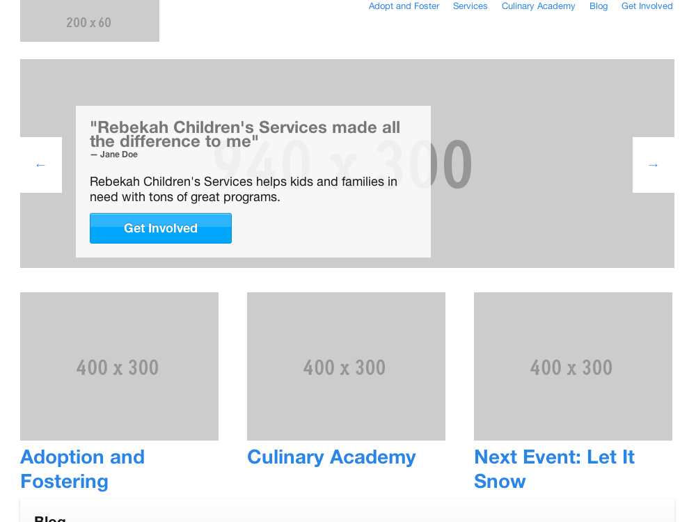
- Services like placehold.it give us an easy way to drop in image placeholders to block out content. Just pass in an image source like "https://placehold.it/400x300" and get back a 400x300 image. Pretty sweet.
By those powers combined, we can create coded wireframes really quickly, and with a high degree of fidelity. The downsides are fairly minimal but should be mentioned ' you don't have pixel-level control without a lot of extra effort, and adding in things like icons or less common widgets is not as simple as it is with the stencil libraries in something like Omnigraffle. We haven't found this tradeoff to be a problem. Now let's talk about what we do get.
Significantly Better Feedback and Iteration
We've always been hounds for feedback, but the feedback we get on coded wireframes is quite a bit better than it is on static screen. The client can get a feel for the flow and have a much clearer picture of how the final product will work, not just what it will look like or what functions there are.
Multi-Device Testing
We live in a world where your products need to work on almost any random kind of device. Static wireframes simply can't represent that kind of world, and coded wireframes absolutely can.
 See one of our first coded wireframe projects, for last year's ZURBwired event.
Correct Context
Much of our impression of a service is colored by how we see it, and, in this instance, that means the device we view it on. The feedback we want will vary greatly depending on whether the user sees our work on a phone or a 30" display, and if they see it on the actual device with the affordances and restrictions it carries. Maybe tap areas are too small, or the layout looks weird on a large monitor. All things we want to know.
Try It!
It doesn't hurt to give it a shot and, at the end of the day, wireframing in code leads to a better product. The feedback is better, the feel is truer, and the final implementation is smoother. Download Foundation (or another rapid building framework) and create some wireframes by just hacking on the provided index.html, then let us know how it goes in the comments.


