Designers working on web projects in 2017, in some ways, face more challenges than ever before. They have to create engaging websites, apps, and services that work seamlessly across all devices and work for a global audience at a pace that seems to speed up every year. That audience too is more tech savvy, have higher expectations and are more design literate than ever before and expect near perfection. Faced with these challenges, it's more important than ever for designers to be aware of emerging trends, solutions and patterns that can help them solve common issues, capture the full attention of their audiences, and deliver amazing experiences.
Here at ZURB, we've helped hundreds of companies surface the best solutions and take advantage of new patterns in their websites and products. We've created this list of 17 design and development trends we think every designer should be familiar with to shape their 2017 and well beyond.
(In no particular order...)
1. Brutalism
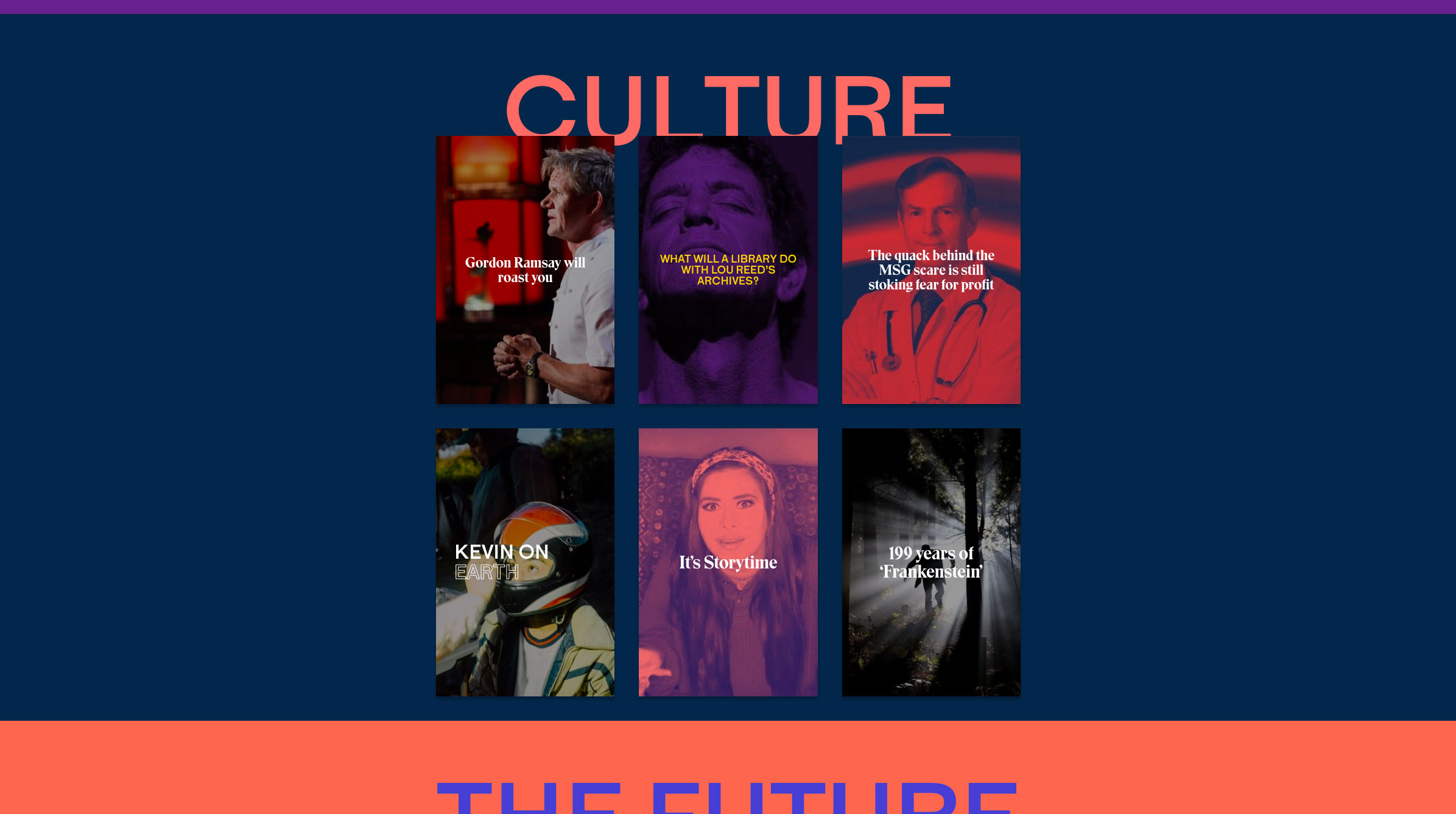
Taking its name from the architecture style of the 60's and 70's, Brutalism in design consists of bold, in-your-face collages of text and images, where anything goes. Echoing the web from yesteryear, Brutalist sites often employ simple markup, inline styles, and harsh colors and gradients. Some even argue that Instagram's new(er) gradient logo could be classified as Brutalist, with it's 90's esque neon colors and gradient design.
Pascal Deville, an authority on the Brutalism trend, and founder of brutalistwebsites.com defines the movement as this:
'In its ruggedness and lack of concern to look comfortable or easy, Brutalism can be seen as a reaction by a younger generation to the lightness, optimism, and frivolity of today's web design.'
But not all Brutalist websites are an all out attack on the eyes. A few sites like Bloomberg News and TheOutline.com borrow from the aesthetic while adding a level of polish not typically seen in most sites.
We think designers can use Brutalism to set their site apart from the rest with bold color choices, large typography, and layouts that break away from the common hero-image-then-3-up pattern.
- The Brutalist aesthetic makes good use of typography, so choosing the right typeface is critical. Check out these tips for conveying the right typographic voice.
- Brutalist websites run the gamut from mild to wild. Get inspired with these examples.
- Spotify has been flirting with this style for a while. Check out how they make use of bold colors, strong typography, and a collage inspired layout.
2. Large Screen Design
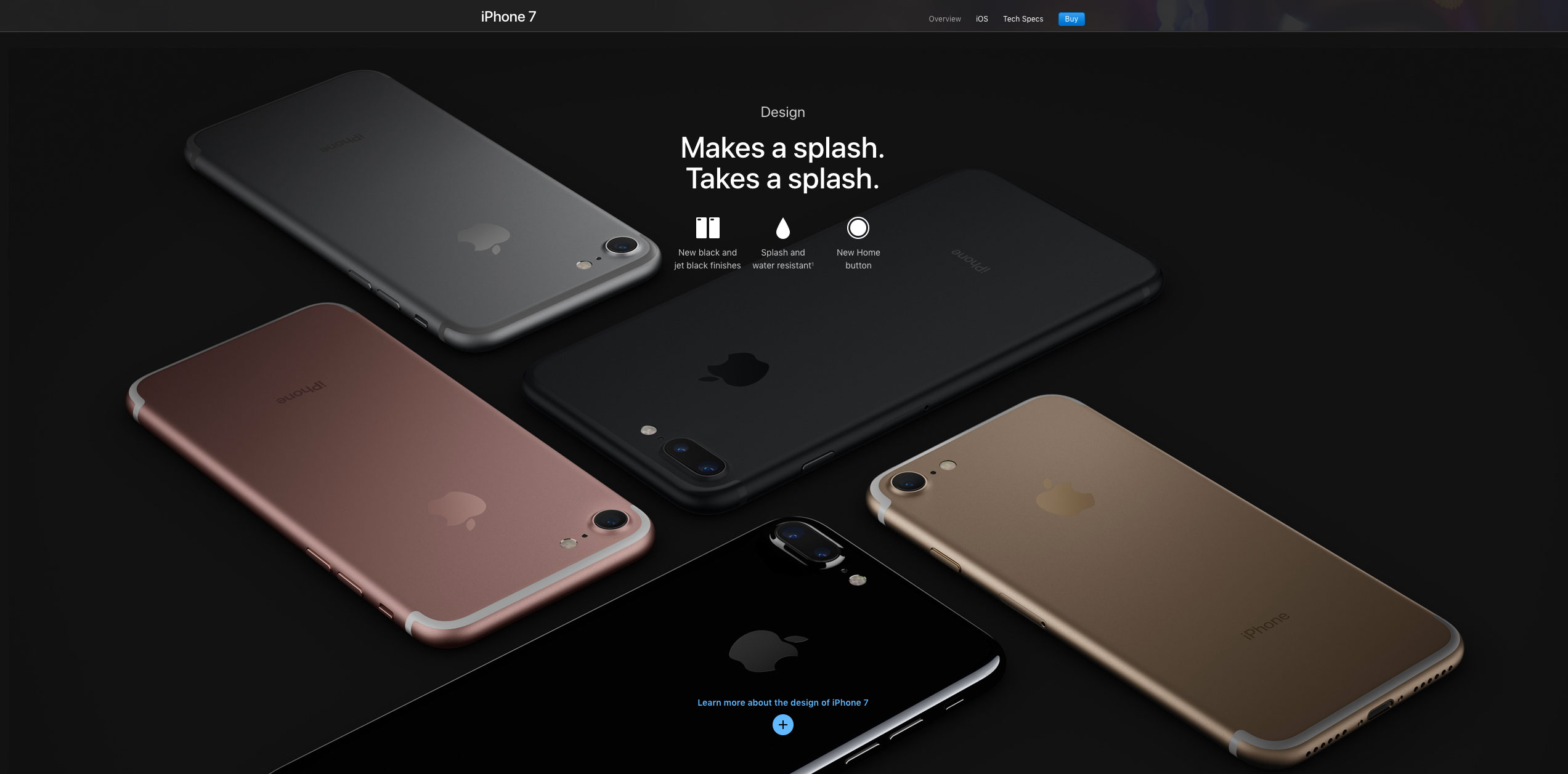
When most people think of responsive web design, they think of shrinking a website down from a desktop to something that looks great on a tablet or mobile phone. But this is ignoring a growing segment of users, those that have large scale monitors. Yes, while mobile has certain exploded in popularity over the last ten years, so has extra large monitors with ever increasing pixel densities. The problem is that most focus has seemed to be on the smaller side of the spectrum with, few sites truly catering to their large screen users. By looking at your data, you may find that the majority of your users, or at least you're converting users are on displays of 1920x1080 or higher. There are a lot of cool and creative ways to use that kind of screen real estate and clever designers are not afraid to go big.
We think designers should be well acquainted with the data and know exactly who their audience is and what equipment they're on. By using techniques like resolution independent SVG's, bold typography, and serving up either high or low resolution photos with JavaScript, they can deliver a rich experience for everyone, even those with massive screens.
- SVG’s are perfect for large screen design because they are scalable, resolution independent, have small file sizes and are supported by most browsers. Here are 10 resources to learn more about them.
- Targeting SVGs with CSS allows you to do cool things like using media queries to hide and reveal parts of an image by screen size. Check out our lesson to learn the basics.
- The Interchange component in Foundation uses media queries to load the images that are appropriate for a user's browser, making responsive images a snap. It decreases the load times for mobile users while still serving the bigger content to your visitors with higher screen resolutions. Learn how to use it.
3. Responsive Components
It's been nearly 8 years since Ethan Marcotte introduced the concept of responsive web design to the world, and we've seen it develop at an incredible pace. There are new techniques and technologies on the horizon though, that are going to dramatically simplify the write of responsive elements and make today's responsive sites look simplistic and naive. Some examples are element queries and the upcoming CSS-grid spec. These two technologies will enable web designers and developers to create experiences that are truly tuned to every device size. Element queries will allow creating components that are responsive based on the space allotted to them rather than the full screen size, while CSS-grid allows us to dramatically change layouts based on media queries.
Between the two, we believe we will see dramatic increase in the diversity of responsive patterns easily available to designers and front-end developers.
- Element queries and container queries open a new horizon for responsive components, here are 10 resources to learn more.
- The Foundation team broke down how responsive components work and what’s coming in the near future in this recent article.
4. Device Specific Microinteractions
Up until now, the mobile-first method has meant building a slick and usable experience for small screens, and then layering in more complex interactions and animations for the desktop. But as mobile web tooling mature and mobile traffic eclipses that on desktop, we think there is a ton of opportunity to take advantage of the native paradigms of different devices for mobile-focused interactions. With the rise of touch and gesture related JavaScript libraries, there is a ton of opportunity for subtle animations in response to gestures (e.g. the Twitter mobile app's tweet refresh interaction) to make their way into more and more web applications.
As Nick Babich pointed out in a recent post on Medium, microinteractions provide users acknowledgement they crave. Popular apps like Slack have skillfully weaved them throughout the entire experience, delighting users and making the app feel more intuitive.
By taking advantage of whatever is available to them, device specific microinteractions will only serve to make microinteractions more compelling and personal.
- Learn the basics of microinteractions, why they’re important, and how to use them.
- Playing around CSS animations and transitions can help you build and test some neat microinteractions. Here’s a few techniques.
5. Split-screen Design
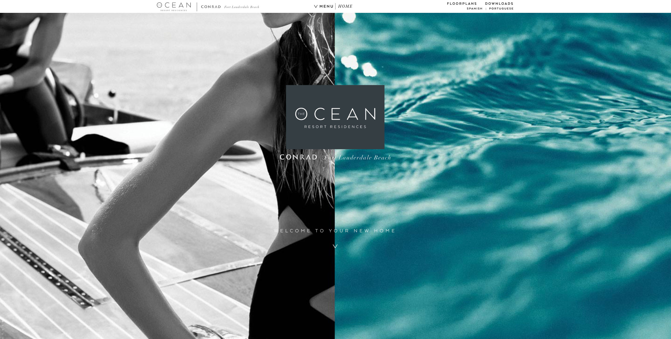
A simple way to highlight a contrast, balance text with images, or share two different products, split-screen design has grown in popularity with many designers. Easy to implement, split-screen design is a great way to present content in a way that feels fresh and balanced. For products or sites that require a comparison, split-screen design is a no brainer.
We've seen some really creative uses of split-screen design, and we think people are only beginning to scratch the surface. We're looking forward to new ways this pattern can be used to tell a unique story and guide users.
- Get inspired with some great examples of split screen design on Pattern Tap.
- Still need inspiration? These 20 examples showcase some really creative applications of this trend.
- Nick Babich offer some clear best practices for split screen design you should definitely adhere to.
- Just because they’re simple doesn’t mean they’re easy. Here are three things to keep in mind when building a split screen layout.
6. Reactive Animations
The explosion of native mobile apps this decade put a spotlight on human centered design. Apple's iPhone and iOS were breakthroughs in part because of the way they used design to mimic humans and appeal to emotion. How good a design looks now plays second fiddle to the way it feels. While mobile apps have been the driver of these breakthroughs, desktop experiences have still felt clunky and unintuitive. But advances in desktop browsers, JavaScript, and CSS variables, have made it possible to add those human focused interactions in really compelling ways.
We think we'll soon see more technologies that push what's possible in the browser, led by animation heavy interactions.
- Our Reactive Listener playground piece is a great example of how reactive animation can be used to highlight content to users even before they take action.
- By harnessing the power of JS and a little CSS, combined with the capabilities of modern browsers, we can deliver experiences that are responsive, fluid, react to user input and give native mobile apps a run for their money. Here are 10 resources to start with.
7. Refreshing Card Based Interfaces
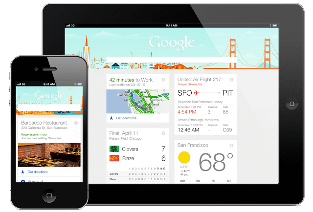
While cards have been around for years, they are a solution that is not going away anytime soon. A pattern tailor made for responsive web design, they make it easy to display large amounts of information in a way that is easy to browse and simple to implement. In recent months, we've seen them used for more than text and links, becoming hubs of all kinds of rich media. Designers are playing around with rich microinteractions within cards themselves, and are finding ways to make this old pattern new again.
We see no reason to abandon tried and true patterns that solve common problems, and are excited about the new experimentation we're seeing with cards.
- Cards are all over the web, but we still see designer making these 5 mistakes.
- Not a big reader? Learn how to avoid those 5 mistakes by watching this video.
- Cards are the basis for a ton of successful interfaces. These 10 resources will help you figure out how to best use them in your project.
- Foundation’s new Flex cards open you up to all kinds of possibilities. In this lesson, Rafi breaks down how to use this new component.
- Nick Babich highlights some best practices of using a card based UI in this incredible article.
Download the PDF for 10 More Trends, Exclusive Resources and Tutorials
The world of the web moves at light speed. It requires designers and developers working in it to constantly soak up new information, techniques and strategies to stay effective and impactful. To help them stay up to date and on top of new trends and solutions, we publish Responsive Reading, an email magazine covering new developments in responsive web design each month. It's free to sign up, and if you join now you'll get a free copy of our 17 Responsive Trends PDF that contains all 17 trends along with links to resources, tutorials and articles that will help you implement these trends in your own projects today.


