We've been talking a lot about frameworks lately, whether it's a responsive front-end one like Foundation or an email one like Ink. One of the advantages of a framework is that allows product designers to worry less about building across devices and spend more time improving their skills. After all, for a designer, there's always a new skill to learn or improve on.
For our team of product designers, the skill to keep pushing has been visual design. Our projects have always had a simple set up: one designer, one design lead. Since each designer owns the whole project from start to finish, they owned the visual exploration phase as well — until about a year ago. That's when we decided to spice things up and split the exploration between three designers, giving the team an opportunity to learn from each other. Which incidentally allowed us to show a greater variety of options to our clients. Everybody wins.
It was a great idea. We saw a big increase in the overall level of visual design skills here. Though to be fair, the improvement was mostly evident among the designers who volunteered themselves the most.
Now we're iterating on this process again. To see how we can level up the entire team. We're mixing a bit of the old with the new — putting the pressure back on project's designer to own the majority of the exploration process, but giving fellow designers an opportunity to inject a bit of creative spark into it.
Keyword: Exploration
Clients always want options. Distinct, viable, amazing options. Creating distinct, awesome options is hard. Many designers tend to fall into their own comfort-style and getting out of it means to challenge your skills. It's difficult. And absolutely necessary for the first exploration pass.
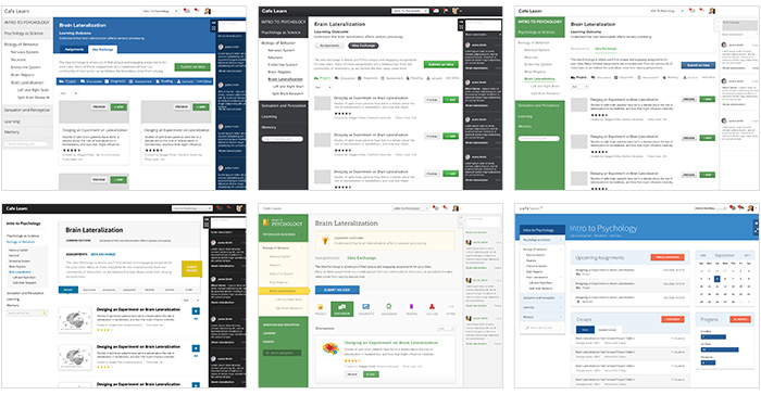
Our new approach has the project's designer creating six to eight quick-and-dirty layouts — we call them directions — in about three hours. This pushes the designer to think in broad strokes, keep moving and not fixate on details that don't create value. In the end, each direction must have a unique point of view, a story.

We found that when a design direction doesn't tell a story, it becomes impossible to defend and get buy in from stakeholders. When the only distinction between options is the color of the top-bar or header font, you can find yourself in a debate over personal taste versus what the visual says about the product or user you're designing for.
Bit of Healthy Competition
Somewhere deep inside every designer just wants validation that he's good designer. We want to see how another designer solves the same problem (and gauge our solution against theirs — we know you do that too). We saw that when we pitted designers against each other, they pushed themselves hard to design something the others would admire.
We also noticed work getting better overall. Our visual design rockstars were teaching others their craft without even realizing it. Simply by explaining their process and how they made design choices — typography, color, imagery, all the little details that make a design unique — they were influencing how less experienced designers tackled their next project.
From the first exploration of six-to-eight directions, we pick the three most promising and divvy them up between three designers. They are asked to iterate on the direction, not start from scratch. Why? Because the story has to hold up after they're through with it! After a day or so of work, we reconvene and review the work. We talk about it, are brutally honest with each other about what works and what doesn't. Then we go back to make it better.
Dishing It Out and Taking It
We have become super adamant about using design terms and principles when giving each other feedback. We can't just say "This typeface doesn't work." We have to say why. This forces us give concrete reasoning for our feedback — maybe the font is illegible or doesn't complement some of the iconography — that actually gives the designer something to work with!
By looking at each other's work and critiquing it, designers started seeing their own layouts in a new light. After you comment on someone's margins a couple dozen times, you start paying attention to yours. It's just natural.
Plus, giving each other feedback has given us ammunition for presenting work. We have trained each other to validate design decisions and preempt questions the viewer (say, a client) may have. We have fun practicing these skills too. During our weekly design team scrums we often play a feedback game, changing up the rules every time, like:
- Two teams take turn giving feedback on a layout. Team who uses the most design terms wins!
- Paired up designers have to give feedback together. One person starts and the other has to finish their thought.
- Break designers into two teams. One has to defend the design, the other has to tear it apart.
- Designers randomly pick flashcards with design terms, which they have to use in their feedback.
Hey, we like to have a bit of fun with our work. Well — a lot of fun.

It's Not Always Talent. A Lot of It is Just Practice.
If we had learned anything from changing up our visual exploration process is that designers can have tremendous growth by practicing visual design skills. That's because design is not art. Design is solving problems through a visual language. And you can get really good at solving design problems by tackling a lot of them, and often.
The only way you can improve — well, just about anything — is to get feedback, iterate and get feedback again. Being open to other designers' opinions and practice actually makes you a better designer — we've seen it work wonders in the last six months. We have a super passionate, committed team. We encourage and push each other. And every single project is upping the ante on the one before.


