We've been having a lot of conversations lately at ZURB HQ about mobile. Occasionally, our conversations come back around to Email. Sure, when it comes to the internet, we hang out in various apps and sites like Facebook or Twitter, but where is it we actually live? Email.
Which is why we realized that we have to provide a valuable email experience for people. We have to offer a pleasant interaction. At the same time, we have to be able to create an actual extension of our products. We had to ensure that email is the first service our apps are efficiently integrated with, particularly when it came to Notable.
Here at ZURB, we set out to give our customers a reason to love their email notifications from our app, Notable. So what determines an effective email experience for people using your apps and what really are the best ways to make that happen? Here's what we've learned:
1. Design Mobile First
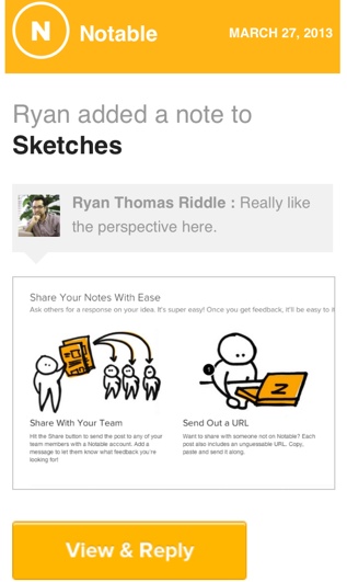
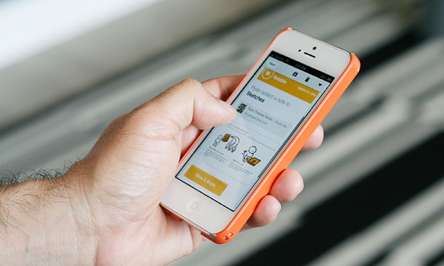
First, you have to think about what your user is doing when they open their email. A customer could be anywhere from sitting at their desk or waiting in line at the grocery story when a notification hits. We've found that at least 30% of our customers were opening their Notable newsletters on a mobile device. Knowing this, it's crucial to design emails Mobile First. Check out how we put together our Mobile First emails for Notable:

There's one important thing we've found and try to remember. When working from a mobile device, people really just want to stay at their home base and don't want to be forced to hop around from one app to another.
2. Make the Content Count
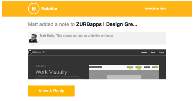
Every single email that goes out should have one, very clear call to action but still allow for the user to decide what they want to do. This allows us to create compelling content while still allowing the user to remain on the same screen. The shot below showcases this. It shows the exact note left on Notable with the clear action of "view and reply." But now the Notable customer can determine if they need to responde to the newest comment or let it wait.

Essentially, we want to give people enough information so the decision to take any in-app action is directly placed in their own hands. Showing users as much information as possible in one place is how we achieve this. When it comes to creating an email, we wanted to:
- Clearly show the reader what type of update they're getting
- What item the update is referencing
- All of the available comments and/or notes that are relavant at the time
Once the email has been read, the user has all the information they need and can decide where to go from there. Forcing a click over to the app could actually curtail engagement if someone isn't able to see what they're even looking for in the first place. Or even if they just don't have the time.
3. Write Clear Subject Lines
Another thing to keep in mind is the actual audience of your emails. A clear subject line is more likely to engage someone than an elusive one that just makes mention of your app. By doing so, you'll also allow people to create and apply organizational filters. In other words, you'll be fitting into their workflow rather than imposing upon it.
Additionally, grouping similar updates under the same subject can be a huge benefit. Many email clients will automatically group emails by subjet or by custom configuration, making it so much easier to manage multiple updates. One last thing to note, especially since there are still some email clients that remain text only, you should also include a plain text option, even if only to say "Hey, there's an update!"
4. Let Them Control the Frequency
Lastly, limit emails to one per task. This actually lets people use their emails as task items for later review. For those who don't need this feature, they should have the option to filter or even shut off these emails. Notable lets each account holder to determine the frequency of their notifications, which is great because everyone ha different preferences and means of organizing their emails.
5. Take Note of How Others Do It
There are other apps that have done a great job of integrating their emails — take a look at your notifications from Facebook and LinkedIn, for example. You get the valued information that you need regarding a specific update that occurred. However, they both still encourage a click over rather than letting you decide if you need to click over and take a look.
And if you don't have the time what's the most likely reaction? You're just going to read the email notification, delete it and then (probably) forget about it. This is exactly what we don't want to happen for our Notable users and, again, why we were so adamant on creating an unbeatable email experience for them. An experience that extends the app and keeps the entire procedure as fluid as possible.
6. Recreate the App Experience
As we said, forcing someone to click over can seem rather forceful, not necessarily creating a positive interaction. And what we've been saying throughout our tips is that you really have to replicate the same experience on email as your customer would have with the app. Recreating the app experience in an email allows you to provide valuable content and not just drop an alert in someone's inbox.
If you're able to provide all the value from an update in an email, then you should do it. Just like when we read our mail at home, we have the option to pay that bill now or come back to it later. After all, why shouldn't we have that same luxury when it comes to our email inbox regardless of where we are.
