We're currently in the midst of a project where we are truly taking a mobile-first approach in responsive design. The other day, we had an epiphany while hashing out the finer details of how the mobile interactions of the project would work. We realized that we were still looking at the problem from a desktop worldview down to a mobile view, as opposed to going upward from the smaller device.
It was a reminder that we're beginning to really understand the problems we're solving in a mobile context. Josh Clark, of Global Moxie, has an excellent way of thinking about it. Our friend LukeW took copious notes at Clark's recent talk at An Event Apart in Atlanta. Here's the gist from Luke's notes:
We're no longer visual designers but industrial designers as well.
Don't get Clark wrong. Visual design is the additional layer that brings context to our interactions. Visuals are the face of our products that help us communicate their purpose. But with mobile, we're designing for touch. We're designing not just how our designs look on our screens, but how they feel to our fingertips.
Let's take a closer look at what Clark is getting at, delving deep into a couple of his points.
Thumbs and Navigation
Think about how you hold your phone. You mostly use one hand, as Senior Nokia Researcher Rachel Hinman points out. You use your thumb to swipe and navigate an app or site. To paraphrase Rachel, your major menu items should live in "the thumb zone" so that your thumb can do the navigating.
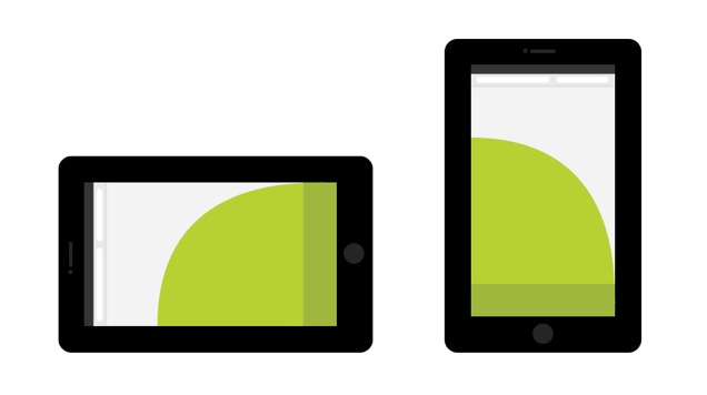
 The thumb zone on a smartphone with the navigation easily accessible at the bottom.
Clark puts it this way in his talk: content at the top and controls at the bottom, or content above, navigation below. But it doesn't have to be that way with responsive design. Here's a few suggestions from Brad Frost:
- The Toggle, where the navigation drops down once you tap the nav icon, like on Microsoft's responsive site. This type of navigation keeps users in place, but it relies on javascript to trigger it.
- The Flyout, or Off-Canvas, where the navigation slides from the left. You find this on your Facebook native app. We've put together some of our own as well that can be used for your responsive design. Disney uses this type of nav on their responsive site.
- The Footer. This frees up header space and puts content first as Clark states in his talk. Yet it's hard to discover and access.
Regardless of where your navigation falls within the thumb zone, one thing to keep in mind, as Brad states:
Ultimately, mobile navigation should be like a good friend: there when you need them, but cool enough to give you your space.
Touch Targets
Another thing to keep in mind, as Clark mentions in his talk, is touch targets. Imagine you're trying to do something on your mobile phone. You're about to publish a really in-depth post, but your fingers miss the "publish" target and hit "cancel" instead. That masterpiece you spent the better part of an hour typing with your thumb is lost to the ether. It's a pain when the call-to-action is butted up against another crucial action.
The optimal touch target, Clark said, is 7mm. That's about the size of your typical finger. Anything smaller would result in a user tossing his phone across the room in frustration. OK, maybe not that dramatic, but you get our point.
One insight from Clark that really caught our eye was that extra taps and clicks aren't evil. It's not that we should avoid additional steps, but make each step, each tap, be a meaningful one and not a wasted action.
Digital is Becoming More Physical
One last point from Clark's talk is that the digital world is becoming more physical. And it's one of the realizations that we must keep in mind when designing responsively from a mobile-first approach. Because we're no longer designing just visuals, we're designing physical interactions. We're industrial designers, but then again, weren't we always?
