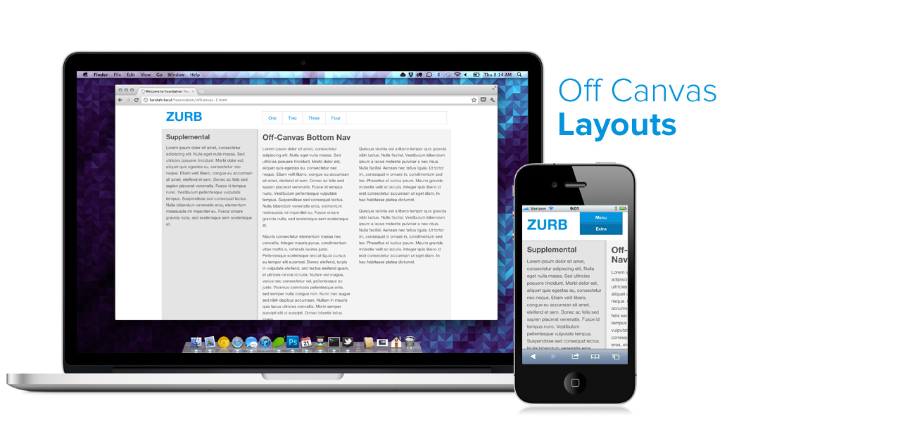
Yesterday, Luke Wroblewski and Jason Weaver published a group of off-canvas, multi-device layouts to demonstrate these new patterns. Off-canvas layouts will probably be most familiar from apps like Facebook, where the menu is off the left-hand side of the screen. We've been working these past couple of weeks with Luke and Jason to take Jason's very clever code and adapt that to Foundation, so that you can use these new layouts with the added benefit of the entire Foundation framework. We even used Foundation 3.0a, the full release of which will be available a week from today.
Check out the Playground Piece →
What Are the Patterns?
We adapted or created four patterns to use with Foundation, each of which feature interesting layouts you can download from the ZURB Playground and start using or hacking on. Each of them has a very specific small-device layout, as well as a similarly specific larger device layout (tablets or desktops).
Bottom Nav Layout
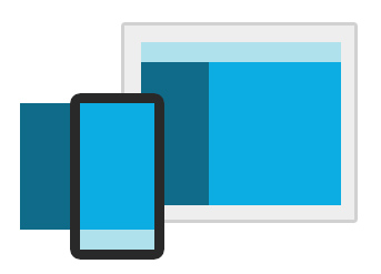
In this layout, the desktop or tablet view has a top navigation as well as an 'extras' panel on the left. On small devices that panel slides off the screen and can be summoned with an 'Extras' button on top. The menu moves down to the end of the page, and the Menu button simply pulls you down the page. This is a fairly common off-canvas layout with a standard navigation for small devices.
See the demo →
Top Nav Layout
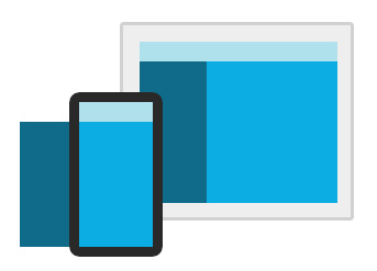
This layout is similar to the first, except the navigation instead of moving to the bottom is slid off the top of the canvas, and summoned much like the sidebar with the Menu button. This is great for instances where you want an off-canvas sidebar and nav, both available as off-canvas elements.
See the demo →
Paneled Layout
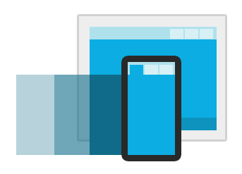
This is the most different of the four layouts. On larger devices there are several stacked panels, a pattern you may have seen in our own Manifesto. On small devices, the panels are lined up horizontally and shown one at a time, with tabs to switch between them.
See the demo →
Sidebar Nav Layout
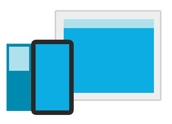
Finally, this was a layout we knew we would want ourselves. On larger machines there is no sidebar or extras element, but on small devices the navigation is moved over to a new sidebar, which starts off-canvas. Unlike the first two the sidebar is only present on small devices, leaving the full canvas available on larger screens.
See the demo →
What Foundation Provides
The layouts provided by Jason and Luke are awesome and were invaluable in creating these Foundation layouts, but we wanted to be able to use the rest of Foundation with these as well. We've restructured the original layouts to use rows just like Foundation, meaning the markup not only is familiar but you can nest the grid within these layouts for extreme flexibility.
In fact, much of the markup will look familiar. We're using Foundation Nav and Tab elements for the controls, button elements to summon sidebars and menus, and a lot more.
Oh yeah, it's Foundation 3
We adapted these layouts using Foundation 3 (3.0a, to be precise) meaning you can work with these as SCSS, you get the new Modular Scale typography, and everything is built with box-sizing: border-box for even easier customization and layout.
This is a prerelease version of Foundation 3 — not everything in it is complete. However if you want to get your feet wet with Foundation 3, this is a great way to start, and we'll be updating these layouts soon with the final Foundation 3 code.
Big thanks to Luke and Jason for their hard work on not only outlining the patterns, but creating solid code examples. We hope you enjoy playing with these layouts and adapting them to your own use, and we'd love to hear any feedback on the Foundation 3 grid, typography, or other elements (though some will seem incomplete). Foundation 3 officially releases in one week, on Friday, June 29.
