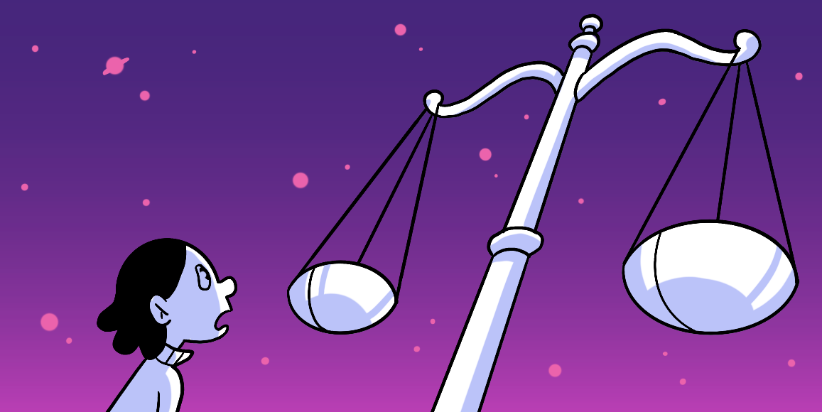
Balance
Harmonize tension and equilibrium in your designs.
![]() Ryan Riddle . 5 min read
Ryan Riddle . 5 min read
The nuts and bolts: Balance in design is the distribution of elements. Balance can be seen as an interpretation or representation on gravity, where large-looking and heavy objects appear to have more weight than smaller ones do because they are closer together on a page for example without it being too much density from one area.
Are you the chosen one? Are you the one stated in prophecy to bring balance?
A long time ago, in a galaxy far far away, it was stated — in prophecy — that the Chosen One would bring balance. Balance to the Force, that is. Anakin Skywalker was the one the prophecy spoke of. He attained balance by destroying the purveyors of the Sith, the dark side of the force, Emperor Palpatine and, shortly after, his own demise.
Oh wait, we’re talking about web page balance here …
But worry not. There is no need to bring about the death of any tyrannical leader or any other type of sacrifices that need to be made to bring balance to your designs. All you need to keep in mind are a few concepts that can change how a user views your page, and the impact that each design will have on the user.
The three concepts of balance you need to focus on in order to create a harmonized experience are:
- symmetric balance
- asymmetric balance
- off-balance
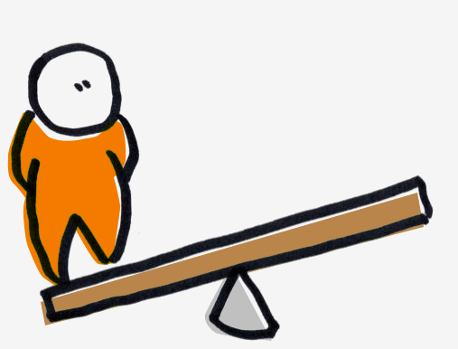
Symmetric Balance
The purpose of a symmetrical balance is for a page to have a sense of stability. If you folded your page in half, the right side would be equal to the left. Or if you folded it so the top and bottom were halved, your top half would be equal to your bottom.
Symmetrical designs help users follow your page in a very structured and organized manner.
More often than not, you would use symmetrical design to give the sense of your product to be steady, reliable, and traditional. In a sense, you would see symmetrical balance as a more business-y approach to web design.
In order to really get an understanding of how symmetry looks for designs let’s look at the example below.
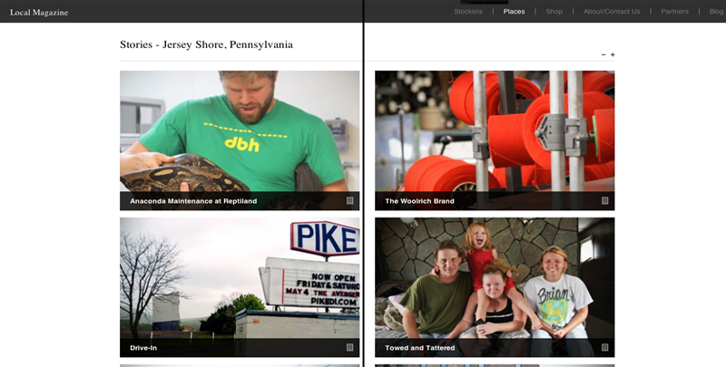
Looking at the whole of the LocalMag site you get a sense of total symmetry. When split right down the center and folded in half, like we’ve done in the above image, all the elements would line up perfectly as if it were looking into a mirror — though the page isn’t exactly centered, you get the general idea. Every element has a matching pair opposite the center divide.
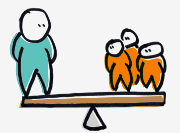
Asymmetric Balance
Say you don’t want exact, cookie-cutter, symmetry with your design. You feel it may be just a tad too orchestrated. That’s where an asymmetrically balanced page comes in handy.
An asymmetric page will help create more tension than a perfectly symmetrical page would. In turn, the tension generates a bit more interest from the user towards your design and your page. In the words of Scotty, it makes the page … exciting.
Asymmetric balance can be attained through the utilization of visual weight. This is accomplished by manipulating the placement of a variety of different shaped, colored and sized elements around the page. If you have a large dark element on one side of the center divide, you can asymmetrically balance that element by placing several lighter elements on the opposing side.
Asymmetric balance doesn’t have to be overly jarring, as can be seen below.
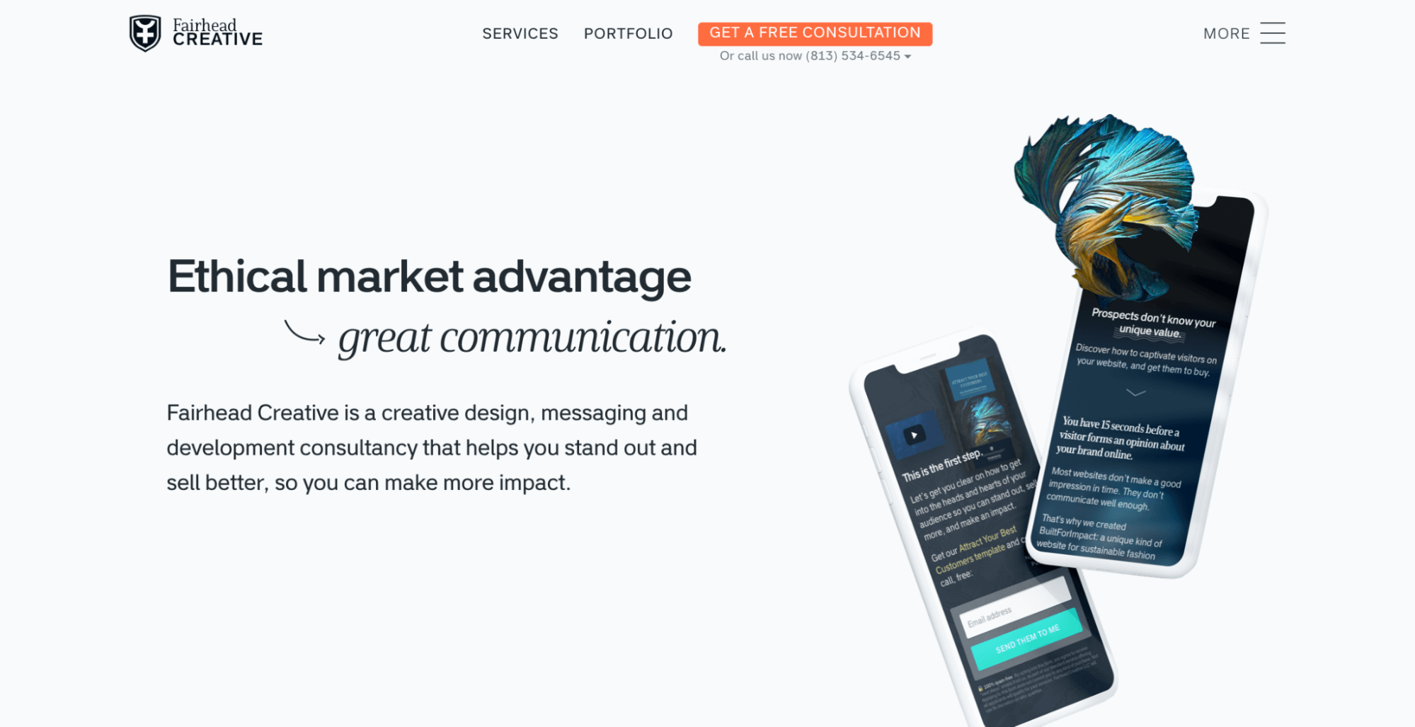
Here you can see here on the FairheadCreative landing page, they’ve implemented an asymmetric balance to the page design. There is no sense of symmetry down a center divide. The visually striking elements vary in weight and size throughout the page lending to a bit of tension, while still balancing each other and the overall page.
The balance is struck through the weight of the elements throughout the page design.
The tension of the elements found on the page, help draw the users’ attention to finish calls to action and proceed to navigate the site.
Off-Balance
Though the very concept of an off-balance design is in direct opposition to building balance for a page. However, the lack of balance can generate a much more extreme sense of excitement to the design.
Off-Balanced takes asymmetrical design and goes the extra mile by creating tremendous tension. This boundary pushing causes the user to feel uncomfortable and uneasy.
There is no way to really set guidelines for appropriate off-balance design. It’s basically taking the rules found with symmetrical and asymmetrical balance and throwing them out of the window. An off-balance design can be extremely thought provoking. But with the lack of balance rules, a design can easily take a turn into horrendous usability territory.
Let’s take a look at how an off-balance design can achieve that visceral uneasy feeling, without losing cohesion.

The designers at CASHmusic created that uncomfortability of off-balance design right off the bat. The images catch your eye, leaping out at you. The page is a bit jarring with the left-aligned text and subject matter, whereas there is nothing to the right of the image to balance out the weight. The same goes for the navbar. All the elements are left-aligned with no elements opposite to balance the design.
Now, even though there is no balance achieved on the fold — part of the page you see upon entering the site — You can still clearly understand how to interact and use the page with ease.
The Chosen One
By manipulating the balance of your page it will determine the overall effect the design will have on your users.
If you fancy a more business-y traditional design, try pushing forward with a more symmetrical design. If you are more akin to the idea of some more tension filled eye-catching designs, why not utilize asymmetrical balance. Or if you’re feeling delivering a sensory free-for-all to your users, to make them feel a tad uncomfortable, why not try an off-balanced design.
You are the chosen one. You are the master of your destiny. How balance is struck, is up to you. And test it you can!
Helio makes it easy for your to bring balance to your pages with an easy-to-use test template. See if your design has gone too far to the dark side!
Website Design Test
Capture a quick yet precise evaluation of your website’s performance by considering usability, net promoter score, and visual appeal.
Use this template for:
- Concept Testing
- See if your site is well balanced
- Validate design choices you’ve made to ensure that user needs are met in a satisfying way