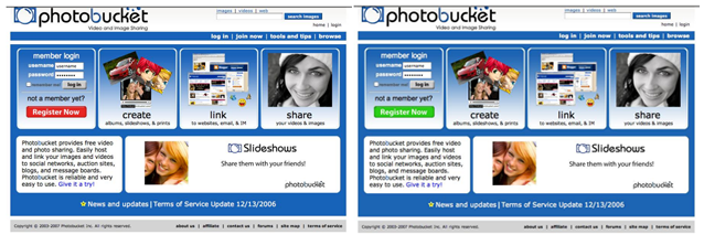
Should I put a red sign up button or a green sign up button on my page? Which one would get the most clicks? This is a classic problem that people building web products often face. People are constantly trying to figure out the one color that works best for all websites. We've been asked this question numerous times: Which color should I change my sign up button to?
The reality is that there is no universal color that works for all websites. There are some patterns that can help you get to the right answer though. The following is a great example of this in practice.
Ok, do us a favor and don't read ahead. Look at the following two screenshots and answer this question: Which version of this homepage got more signups — red button or the green button?

Chances are you thought green had more registrations because "green means go," right? We hear that answer all the time when we ask this question. The reality is that changing the button from red to green decreased account registration from 3.5% to 2.5% (a loss of 7,000 daily registrations).
Why is that the case? The reason in this particular example is that the red had a much better contrast to the blue page as compared with the green button. This does not mean that red will work better on all websites out there; it all depends on the contrast with the background color and several other factors such as placements and copy. You can start to see that while there is no specific color that works best for all websites, there is are patterns you can follow in order to get to the right answer.


