E-commerce teams rarely come to us because something is flat-out broken. More often, it is because an experience looks good but isn't moving people forward as expected.
We wanted e-commerce directors to see, clearly and firsthand through UX metrics, how common assumptions break down in real use. So we ran 20 concept tests across real ecommerce products, including browse pages, product detail pages, promotions, and checkout flows. In each of our tests we paired behavioral signals, like whether people could complete a task, with attitudinal signals, like how confident they felt while doing it.
What we saw was consistent... experiences worked well overall, yet still caused people to hesitate at the moment of decision.
We outline six assumptions that tend to create those moments, what the testing revealed, and what teams can do instead. Let's jsut call these the lies we tell ourselves. The full framework and data behind all 20 tests are available alongside this article for anyone who wants to explore the results in more detail.
“If We Give People Enough Choice, They’ll Figure It Out”
At a basic level, this assumption means trusting people to sort through options on their own. If enough products are visible, the thinking goes, people will naturally narrow things down and land on what works for them.
Unfortunately, this places a lot of responsibility on the user. It assumes they know what matters, how options differ, and how to compare tradeoffs without much help. Our testing focused on whether people could actually move from browsing to choosing when faced with that level of freedom.
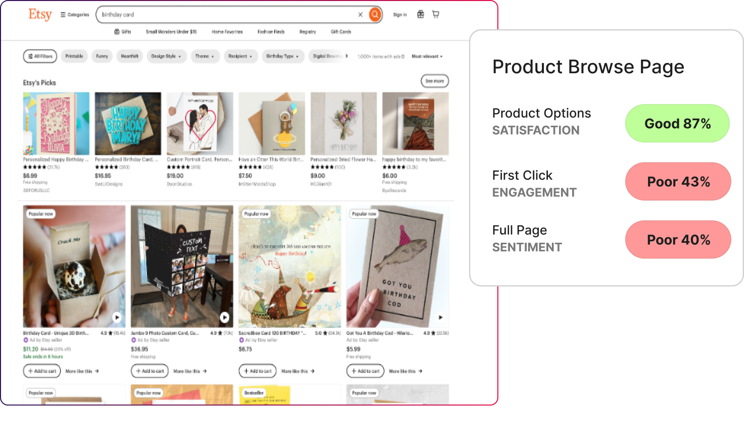
- On Etsy’s product browse page, users rated product options highly (87% satisfaction). But first-click engagement dropped to 43%, and full-page sentiment fell to 40%.
- On Etsy’s search results with filters, search options satisfaction reached 81%, yet filter success landed at 50%, with page sentiment at 39%.
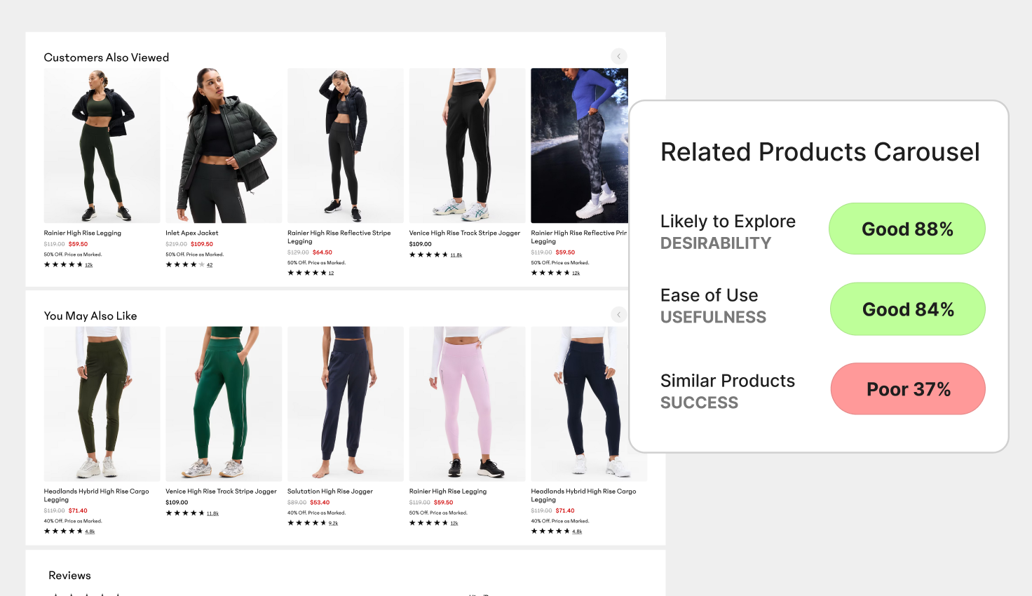
- On Athleta’s related products carousel, desirability was strong (88%), while success identifying a relevant alternative dropped to 37%.
We found that people weren’t frustrated by the number of options... they were more unsure how to choose between them. Discovery wasn’t the problem. Evaluation was.
What to do instead
Reduce the number of decisions people have to make at once.
- Surface recommended paths, not just all options
- Highlight why one option differs meaningfully from another
- Move the comparison closer to the decision moment instead of the discovery moment
The main takeaway here is that more choice doesn’t move people forward. As a leader, you need to make clearer tradeoffs.
“High Engagement Means People Are Interested”
This assumption treats activity as a positive signal. When people scroll, click, or interact with multiple elements, it is easy to read that behavior as interest or excitement.
But what engagement does not explain is intent.
Someone can be very active and still unsure about what they want or what to do next. In our Helio tests, we looked at engagement alongside confidence, success, and sentiment to understand whether activity was moving people forward or keeping them in place.
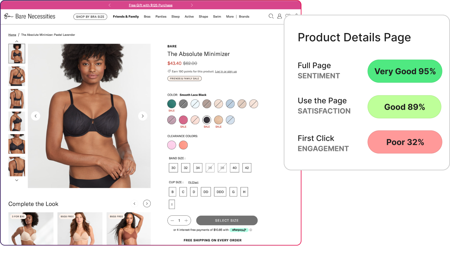
- On the Bare Necessities product details page, full-page sentiment reached 95% and satisfaction hit 89%, yet first-click engagement fell to 32%.
- On Under Armour’s flash sale page, desirability was strong (82%) and engagement was active (63%), but success finding the countdown timer dropped to 46%.
People were doing things, but they just weren’t done deciding.
We found they scrolled because they were still looking for reassurance, and they clicked because they hadn’t resolved the choice yet.
What to do instead
Treat engagement as a diagnostic signal, not a success metric.
- Look for where engagement spikes and ask what’s unclear there
- Pair engagement metrics with confidence or success signals
- Use engagement to identify hesitation, not validate excitement
We found that high engagement tells you where people are stuck, but it doesn’t tell you they’re ready.
“If the Page Looks and Feels Good, Action Will Follow”
This assumption is rooted in the idea that good design creates confidence. If a page feels polished and trustworthy, people should feel comfortable taking the next step.
The question our testing explored was whether positive impressions actually translated into decisions. We paid close attention to moments where people understood the page and liked what they saw, but still hesitated when asked to choose, commit, or move on.
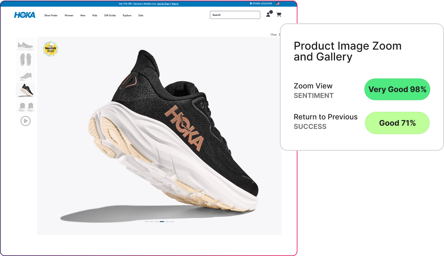
- On HOKA’s product image zoom and gallery, zoom interactions scored extremely high on sentiment (98%), yet success returning to the previous state fell to 71%.
- On the Bare Necessities PDP, sentiment was very strong (95%), but success choosing a size dropped to 57%.
- Nike’s size guide told a different story. Sizing comprehension reached 92%, and sizing success held at 93%.
The difference between sites wasn’t brand polish. It was making the choices clear.
What to do instead
Design decision steps as explicitly as you design the page itself.
- Treat size, variant, and option selection as primary tasks, not secondary UI
- Make the next best action obvious immediately after a decision
- Test decision steps independently, not just the full page
Good design should build trust and make it easy for customers to make a purchase decision.
“Promotions Naturally Point People Toward the Next Step”
At its core, this assumption suggests that urgency creates a clear next step. A strong offer or time-based incentive is expected to make the next action obvious.
In our testing, we examined whether promotional elements helped people act or simply made the experience feel more urgent. By measuring desirability, intent, and task success together, we were able to see whether promotions were guiding decisions or just adding pressure.
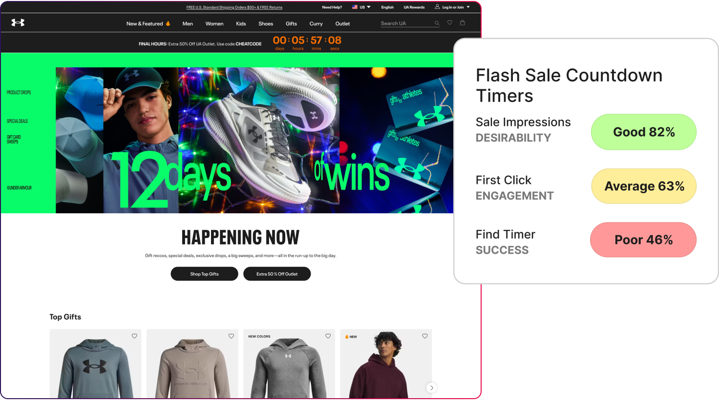
- On Under Armour’s flash sale, sale impressions scored 82% for desirability, while success locating the timer fell to 46%.
- On Etsy’s marketing emails, desirability reached 81% and satisfaction landed at 72%, but next-step intent dropped to 47%.
- On Target’s brand page, brand score reached 79%, yet site usage frequency settled at 67%.
We found that people noticed the offers, but they hesitated on what to do next. Creating urgency raised interest faster than it clarified action.
What to do instead
Pair urgency with a single, prioritized next step.
- Make the intended action unmistakable, not implied
- Reduce secondary paths during promotional moments
- Test whether people can act without re-reading the offer
Urgency in sales offers should remove heavy thinking, not create more things to think about.
“Checkout and Utility Pages Are Just Functional”
This assumption treats checkout and account pages as mechanical steps. The idea being that as long as the flow works and nothing breaks, these pages are considered successful.
Our testing looked at how people actually felt during these moments. We measured not just completion, but confidence and sentiment, to see whether utility pages were quietly reinforcing trust or introducing doubt at the point of commitment.
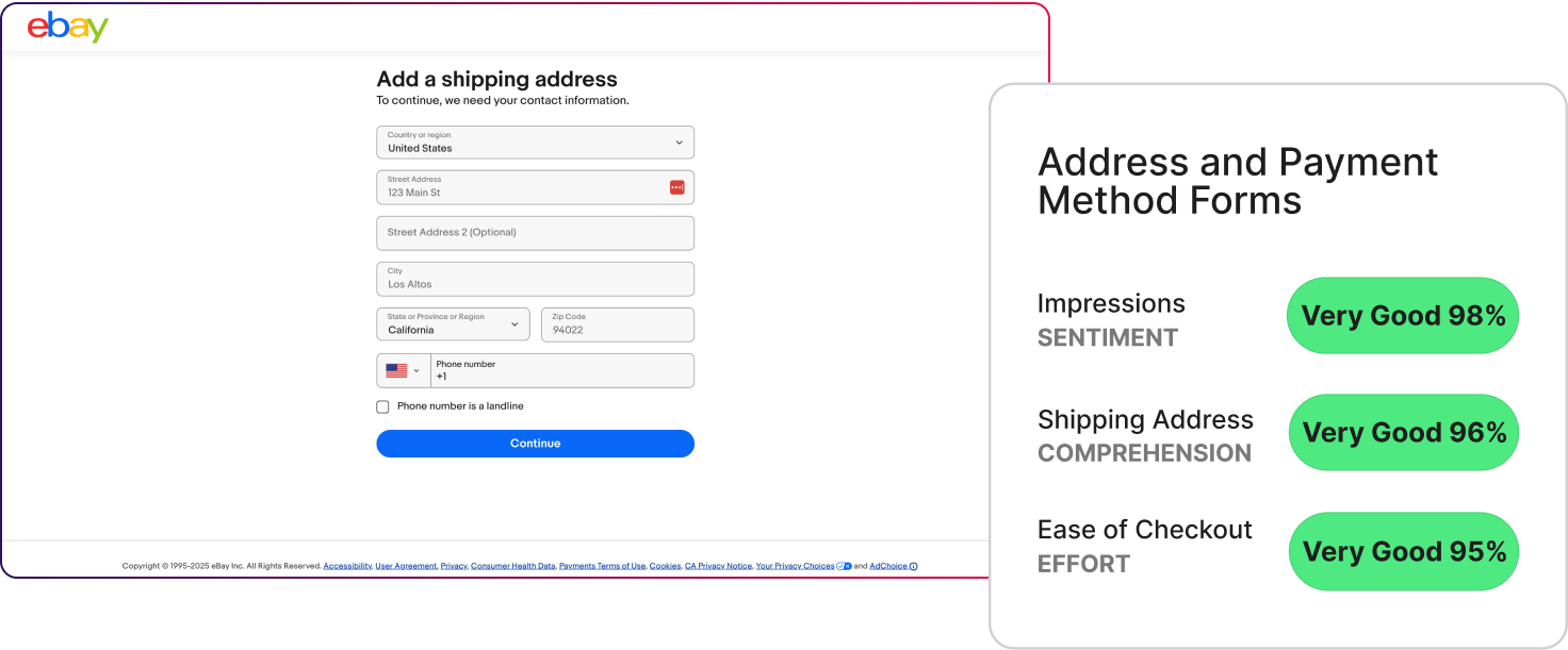
- On eBay’s address and payment forms, sentiment reached 98%, with effort at 95%.
- On REI’s order summary page, comprehension scored 94%, and intent held at 83%.
- On True Religion’s mini-cart dropdown, sentiment landed at 78%, with next-action intent at 75%.
These pages answered quiet questions:
- Is this safe?
- Do I understand what’s happening?
- Can I trust this step?
When the answers were clear, participants had confidence.
What to do instead
Design utility pages as reassurance checkpoints, not just flow steps.
- Use clear language to explain what’s happening now and next
- Reinforce totals, policies, and outcomes at commitment moments
- Test sentiment on utility pages as seriously as conversion
Trust is built over time. When nothing feels surprising, it's much easier to move customers forward.
“Wishlists and Favorites Are Passive Features”
Saved items are often thought of as a convenience feature. People use them to come back later, without much impact on the current decision.
In testing, we looked at what saving an item actually represents. Often, it marks uncertainty rather than intent. We examined whether saved-item experiences helped people re-engage with a decision or left them suspended without direction.
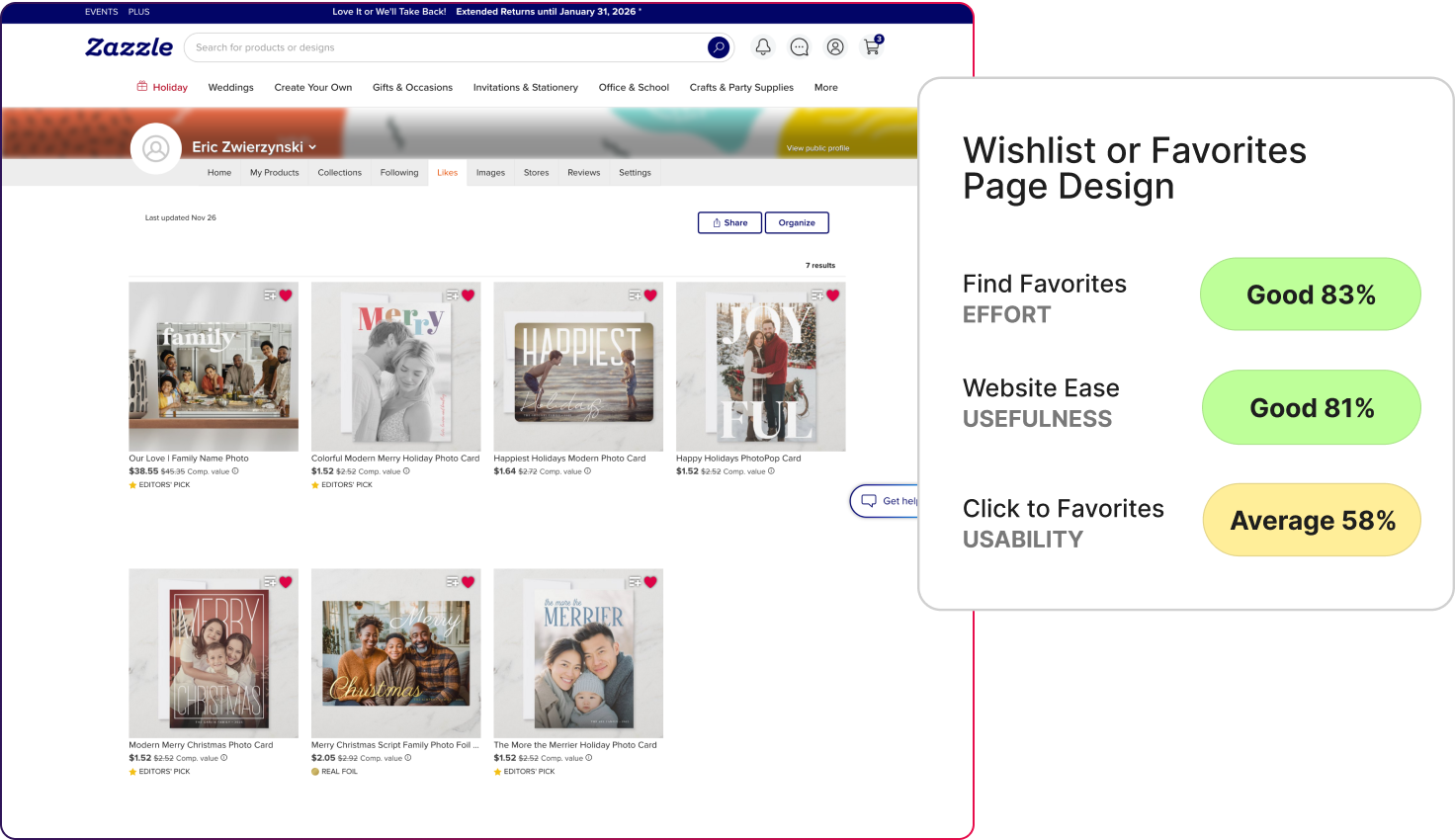
On Zazzle’s favorites page, usefulness scored 81%, and effort to find saved items reached 83%. But usability for clicking to favorites dropped to 58%.
Saving felt easy for participants, but what followed did not. People understood the feature, but they didn’t feel like they were moving forward. Saved items ended up pausing decisions instead of helping people make them.
What to do instead
Design saved states to re-activate decisions.
- Show what changed since the item was saved
- Suggest a clear next step from the saved view
- Reinforce why the item was worth saving
Saving should shorten the path forward.
Conversion takes a hit when users slow down
Across all 20 tests, the same pattern kept appearing.
Most experiences worked. People understood the pages, could navigate the flows, and were able to complete the task. But when it came time to make decisions, many of them slowed down.
That hesitation showed up in different places, from browsing and product evaluation to promotions and checkout. The specific page changed, but the underlying issue did not. The experience did not always do enough to help people feel confident choosing a next step.
This is why completion and overall scores are not the full story. An experience can function well and still create uncertainty at key moments. The value of this testing is in making those moments visible, so teams can focus on supporting decisions, not just making things work.
This is why conversions take a hit.
Where to Go Next
If you want to explore this further, the full framework includes all 20 e-commerce concept tests, the metrics used in each one, and the underlying results that shaped these patterns.
It is designed to help teams look beyond surface-level performance and understand how confidence, hesitation, and decision-making show up across real product experiences. If you are interested in applying this kind of testing to your own product, or want to see how these signals show up in your experience, you can start by exploring the framework or reaching out to run a concept test of your own.
If you need support cutting through the complexity of your ecommerce website, we’re here to help. We work with an audience of over one million participants and use insights from 50,000 hours of testing and five million responses to surface the best answers into your site. We turn website signals with UX metrics into simple proof stories that build executive trust and guide marketing and product decisions.
Let's make your site convert better together.
Powered by Froala Editor