Designing and building products is incredibly invigorating. It's the adrenaline high that's been moving industries forward in giant strides for the last hundred-some years.
When the muse strikes, it's easy to string one idea after another and imagine the product coming to life in fine detail with grand success. But these ideas can turn out to be a well-considered plan without users giving a damn when brought back to reality by tough questions. We, then, turn to Progressive Design to get us back on the right track, grounding the product in reality and challenging the castle in the sky vision.

We turned to Progressive Design with our recent work with Mozilla. Their team already had a concept for a content site centered around advocating for open systems, and we're already far along in their planning. In many ways, the entire operational plan was in place before we started working with Mozilla on honing the essence of the experience for their future readers.
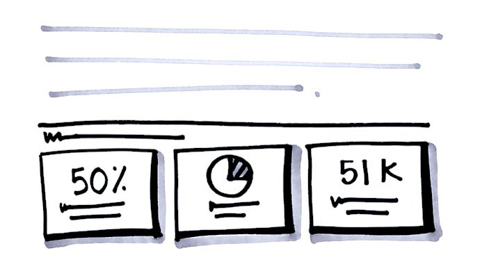
Mozilla's team had done their homework. With a clear vision for the win, they came to us with a detailed feature spec, full taxonomy, and even a concept for a homepage wireframe. They knew exactly the type of content they wanted to publish and already had writers working on stories for launch.
There was just one thing left to do: figure out how to make readers care about the content.
Why Are We Doing This, Anyways?
When we say "Google," you say "Search." When we say "Mozilla," you probably say "Firefox." And though that's rather accurate, Mozilla is much more than its browser. They were looking to create a venue for showcasing their open systems advocacy. The purpose behind The Open Standard, the content site we were tasked with designing.
They were very passionate about the importance of this content site. But during our first few conversations, we couldn't quite understand where the value was for readers. We sensed their fervor. And we were onboard with their plans for writing to a not-so-tech-savvy audience in a witty prose style, ala Jon Stewart. We questioned: "But what are open systems?" And why should we care?

Mozilla looked to us to create something "ownable." But we knew that we wouldn't be able to create a meaningful user experience without getting bought into the product's purpose ourselves.
Understanding the Problem
The problem became clearer the more we interviewed the Mozilla team. We also became more and more fired up about advocating for open systems. Turns out we, as consumers, don't always understand how our private information is being soaked up — say, by social networks when we use them to sign into a new service — and we willingly enter closed systems without any reservation. No, those songs and books on our phones aren't really ours after all.
How did we not know about this problem before? How do we fight against it? We wanted to give power back to consumers. So our early ideas centered on users becoming active participants on the site, giving them tools to affect change within their own communities.

We got pretty caught up with this idea of personal investment and impact, building a bit of our own castle in the sky. And it was the pull-push of Progressive Design that got us grounded again. We constantly challenging each other, and together with Mozilla's team we were able to think big, reel in concepts and iterate on ideas, while keeping the looming launch goal in sight.
Finding the Middle Ground
Although those earlier ideas may become viable for future releases, our focus was on the launch date, which was less than eight weeks away. We zeroed in on concepts that could create differentiation and momentum for The Open Standard in the short term.
The Open Standard had an incredibly tight timeline, the successful on-time launch was a direct result of ZURB's process. While ZURB does a fantastic job with schedules and milestones, it is a balanced approach and we remained agile enough to be creative and explore new ideas without jeopardizing dates or scope.
—Benjamin Sternthal, Web Development Manager
Since we approached this site as its future users, we knew that making the vague concepts concrete was key. After all, it was what got us to believe in the site. We introduced the idea of key takeaways for each article — actionable 1, 2, 3 for readers to latch onto. And to see stories evolve over time, users would be able to browse articles in chronological order.

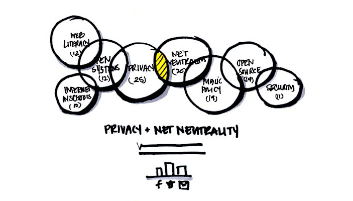
Our desire to "connect the dots" for ourselves led us to the idea of connecting the content throughout the site. Readers would be able to see how stories connect to one another and how larger issues bubble up over time. These issues, slated for a later release of the site, will be a dynamic feature, changing over time with the content. It can also become that "ownable" feature Mozilla needed.

Fastest Launch Ever!
Although all of our projects have demanding deadlines, this one wins the prize. Knowing that engineering was happening in parallel, we got involved with Mozilla's development team early in the prototyping phase. We talked through key functions of the site and negotiated which features would go out in the second release.
Amazingly, The Open Standard launched just five days after we wrapped up the project! Since then, we've watched them continue to crank out great content on a daily basis. We look forward to seeing site evolve and wish the team great success!


