Texture & Shading
Bring more than color to your designs.
 Ryan Riddle . 5 min read
The nuts and bolts: Texture and shading are elements of design that define the surfaces of digital shapes and forms. The texture that a designer recreates on a flat surface is called visual texture.
What does a website feel like? Whatever you want to say. If www stood for “Wind, Water and Walls,” then texture in design would be easy. But the web is a visual medium. Some sites include audio. Touch and smell are hypothetical at best. Ironically, the term “touch screen” has nothing to do with tactile sensation. Pixels are flat.
People know what the real world feels like. They know soft and hard, sharp and fuzzy. More importantly, they associate different textures with different types of objects.
Adding textures and shading to your designs give users a frame of reference by relating content and function to real-world experiences.
Textures Speak Without Words
We rarely use texture, at ZURB, for purely aesthetic reasons. More often than not, we choose imagery to convey a particular tone. Granting texture to design elements helps users feel connected to the content. To build those connections to the user, let’s look at the three types of textures: pattern, gradient and tactility.
Use Patterns to Convey Character
Much like people with recurring habits, good or bad, patterns in design are a recurring set of shapes upon a grid. Usually geometric patterns can influence how users perceive brands and objects.
One type of pattern that evokes a certain feeling would be the diamond cut steel pattern. Most people will think of cold, hard steel. It’s sturdy. Dependable. Tough. Apply a dark metallic motif to anything to emphasize brute strength. For instance, take the pattern in Iron Bartender’s hero graphic.
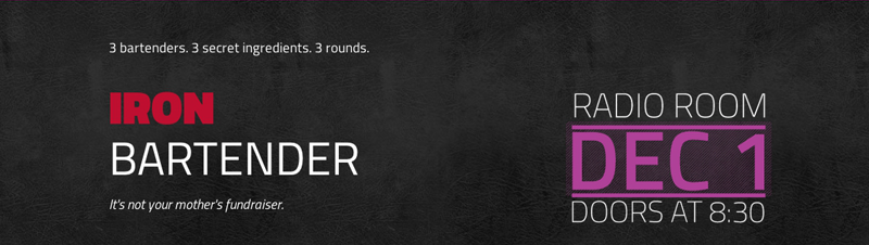
At first glimpse the black background looks interesting with different values and changing shades. Look again. The repeated texture resembles leather. With the name, Iron Bartender, tied with the leather, the combination begins to conjure images of leather bar booths and stools — oh, those local watering holes, libations and the comfort of leather. The association all started with a simple pattern implemented on the design. The pattern really brings the context to life for the user.
Use Gradients to Flow
Not all textures are rough. Much like running water, which by nature has no hard edges, gradients give elements a range of color. Those transitions create a feeling of dimension. More often than not gradients are often used to transition from light to dark colors.
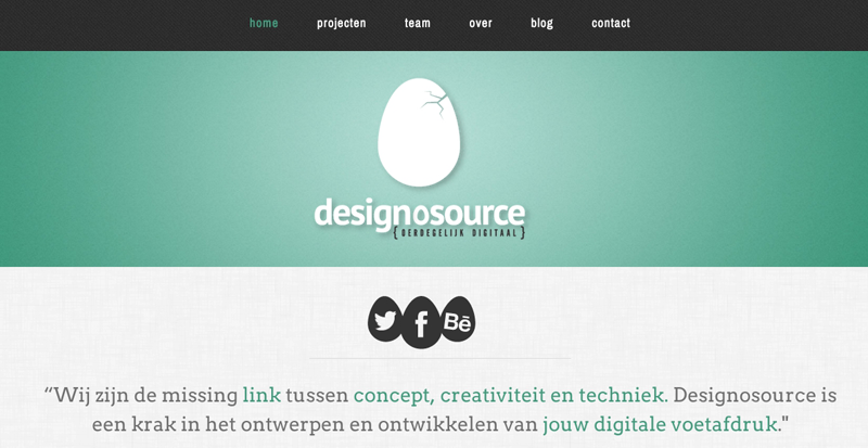
Designosource uses a smooth transition of light green to dark green in their header. This type of gradient helps the user focus on the logo and lend a feeling of depth to the header. Gradients can also give your designs a sleek, smooth texture.
Tactile Textures that Pop
If you were to look at an image that simulated reality, you would be looking at a tactile image. This type of texture is where the real attachment to emotion comes into play. Tactile images are the textures that look as though the design is tangible and the user can really draw context. Buttons are often the best application of tactile design.
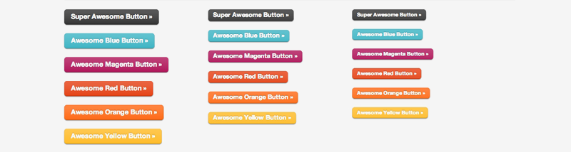
Each of these buttons is just begging for a good poke. In reality, the different sides of an object become more apparent when the object is lit from one side. Gradients provide that vital shading in a digital world. To simulate a true three-dimensional shape, however, we have to look at how shading helped form tactile textures.
Life-like, not like life-like
As much as we’d hope that texturing a design would be as easy as applying a few filters, making a design look tangible involves nitty-gritty details. Light sources and its associated shading are what separate artificial-looking designs from the real tangible looking designs. A misplaced shadow can be the difference between “I can touch this design” and “This is a poor ‘shop job.”
Some of the best shading examples come with button designs. So let’s look again at how a button’s design applies to the three aspects of shading. For instance, here are some super awesome buttons we created with CSS3 and RGBA:
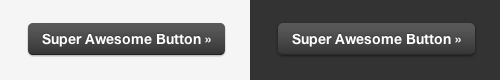
Whether it’s from sunlight or ceiling fluorescents, most people associate light as coming from overhead. Applying highlights to the tops of buttons and shadows to the bottoms implies that the button can, in fact, be pressed. It’s an invitation to act rather than a blatant call to action.
While highlights and shadows help give an object a sense of depth and tangibility, cast shadows help complete the appearance of tangibility. A cast shadow is the shadow of the element you want to be tangible. Really, it’s a lack of light — the area behind an object with respect to a light source.
To really make a cast shadow seem real, it should relate to both your light source and your object. Back to our button example, because we want the user to perceive the light source as coming from above, the shadow has to be placed underneath the object on its lower half. Should the shadow be cast above or to the right, the perception would be incongruent to the overall design, ruining the users’ call to action.
Just Act Natural
Sometimes the best texture is none at all. Recently, our designs have leaned toward buttons with flat colors. No gradients, no bevels, but plenty of reasoning. Before users understood how the web worked, or how smartphones worked, designers used texture to show function. That is, “yes, this graphic acts like a pushable button.” But users have long since gotten used to what links and form buttons do. They don’t need as many real-world hints.
Still, if you decide to design with textures and shades, choose each texture for the connotations they imply. It’s all about using users’ natural associations to your advantage.