Progressive Enhancement
Start small, grow big when planning and designing websites.
 Morgan McGowan . 5 min read
The nuts and bolts: Progressive enhancement is a web design method that prioritizes online content, enabling everyone to access the basic information and functionality of a web page while those with more advanced browser features or quicker Internet connectivity get the enhanced version.

Responsive web design typically takes a top-down approach: Design for desktop, then pare back for mobile devices. Unfortunately the result carries a whiff of “if you were on a real browser … ”
We’ve found a mobile-first approach solves many smartphone-to-desktop layout issues, but the reason mobile-first works has nothing to do with media queries or CSS frameworks. The more a design hinges on viewing requirements, the less flexible it becomes.
Even the best design today can’t account for every way a site might be viewed. Browsers from 2001 can’t understand CSS3. Next year’s game-changing gadget might have facial recognition. Websites that cater to one case break in another. There’s another way.
Progressive enhancement is the idea of designing from a most common denominator — what most users can see — and building out. It’s also the fast track to mobile-first design.
It’s Easier to Scale Up
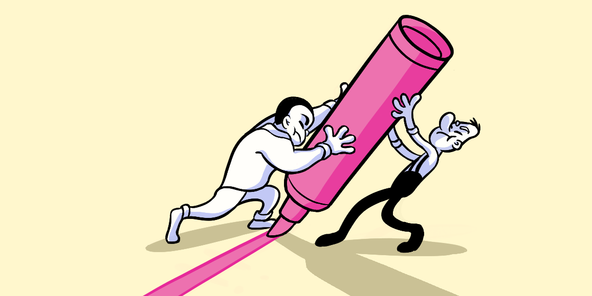
Sometimes the size of a container and its contents matter. For example, a pint of beer — mmm, beer — will fill a lowball glass. But you can only add a portion. Pour the entire pint and the glass will overflow. However, a pint will fit into a pitcher with room to spare.
We’ve found web layout isn’t much more forgiving. Pour a wide page into a relatively narrow browser, and you can only see so much of the content. Sure, most sites are still usable with hidden edges. But the more a page overflows a window, the less usable the page becomes.
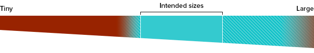
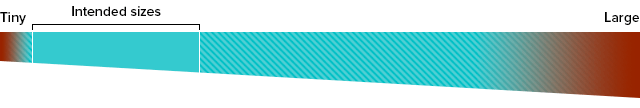
Strangely, growth is one-sided. Sites in windows larger than their intended range either look awkward, and sites in windows smaller than their optimum layout are downright un-usable. So starting small helps us reach a wider range of users because mobile users have trouble with desktop sites — but more people can see mobile-optimized sites.
Here’s the good part: The same thinking applies to more than screen size. It’s better to expand upon a purpose than to backtrack after designing for certain features. But to enhance a site with device and browser features, designers need to start with a purpose.
Build from the Inside Out
Ignore browsers and bandwidth for a minute. What do you want to accomplish?
- Compel users to sign up?
- Enable users to accomplish a task?
- Make them laugh?
- Change their habits?
At the heart of any solid design is a purpose. Let’s say you want people to buy a product. You write persuasive text, shoot photos, collect testimonials, and present everything in a compelling website. It’s designed to sell something. That’s its foundation, its purpose. Then we ask, what would make the pitch better? For example:
- What if the site could point users to the nearest store? “You’re 0.5 miles from BrandCo, a ten minute drive. Their hours today stays open until 6 p.m.” That’s a great feature (on devices with geolocation).
- Would a video help? “Watch the product in action.” That’s great (unless bandwidth is iffy or the user’s environment is noisy).
- What if we made the phone number tappable? “Tap our phone number for free support (if you’re on a smartphone).”
- Should we make the full specifications available? “Download a PDF of the specs (if your computer can read PDFs).”
- Why not show all the praise we’ve received? “Read reviews of the product (if your screen isn’t too cramped).”
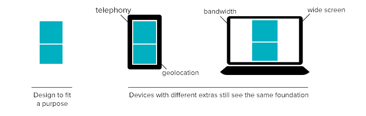
Users without these features get a no-frills experience. That’s fine for designs that treat extra features as embellishments, not requirements. Remember — the frills support your goals. The goals should depend on the fewest frills necessary.
Progressive Enhancement = Mobile-Friendly
Our move to a mobile-first philosophy is a long-term investment with an immediate benefit: Starting small is inherently suited for small screens. On a redesign projectredesign, for example, we considered users’ feedback and how they used the site. We thought hard about users’ priorities, what could and couldn’t be done well on smartphones, and how people would use the site in different circumstances. We learned:
- Mobile users are more likely to browse, somewhat likely to comment, and unlikely to create new posts — not because they can’t, but because work they post is usually on their desktop computers.
- Views can be too condensed: Mobile users would likely prefer more information per post than a stream of text links.
- Most users, mobile or not, would like to see post types again.
Which goes to prove that websites are no longer one-size-fits-all, if they ever were. More like one-size-expands. There’s no such thing as a “mobile” browser vs. a “real” browser, only different circumstances that no designer can predict. That’s why we iterate over goals before adding extras. By itself, progressive enhancement won’t guarantee a mobile-optimized website. But it puts you in a great place to start.
Start your next iteration and put your website to the test with this Helio template:
Website Design Test
Capture a quick yet precise evaluation of your website’s performance by considering usability, net promoter score, and visual appeal.
Use this template for:
- Concept Testing
- See how your website fares across devices with an actual audience
- Find areas of opportunity to iterate on your design