
Mobile First
An adaptive, future-friendly solution for website design
 Bryan Zmijewski . 5 min read
The nuts and bolts: Mobile First is a style of thinking about web design, app design, mobile websites, and the user experience by working from the smallest to the largest screen size choice. It’s all about making websites more mobile-friendly and building a responsive design that adapts to different screen sizes.
We are currently living in a nation with a population of 311,591,917 people. Of that population 53% of the adults access the web through mobile devices. Even more astonishing is that of the full population, 31% of those who are mobile capable access the web primarily through mobile devices — Holy moly, those are some astonishing numbers from the Nieman Journalism Lab!
Our friend and advisor, Luke Wroblewski, has noted a few more astonishing numbers regarding mobile tech and the exponential growth seen throughout the world. One more jaw-dropping stat to throw at you is the fact that it is projected that by the year 2015 mobile data usage should reach 75 exabytes annually (that’s 75 MILLION terabytes)! Guess it’s time to put some thought into building a separate mobile site to optimize those mobile experiences. “But wait, what about responsive web design? Oh, so many choices, and now — I am oh so confused!”
A great deal of discussion/argument/fisticuffs is overbuilding responsive web designs or to simply go forward with separate (mobile and desktop) site designs. With this battle there is no right answer here. Because we are looking at the notion of Mobile First design rather than separate vs. responsive web design.
Humble Beginnings
Mobile First was originally coined by none other than LukeW and has since been gaining more and more recognition within the design community. Luke did his research back in ‘09 and his first write-up on Mobile First. Soon he realized that designers should have a new focus. He saw a trend of ever-increasing numbers for mobile web usage. He saw that the omnipresent Web was being utilized on much more than just desktops and those larger displays. The numbers for mobile Web usage were growing by leaps and bounds. This was what gave way to the fundamental focus of Mobile First.
Mobile First takes the ideas within responsive web design and takes them, to abstract from Mr. Willy Wonka, further forward … and you can only go forward by going backward (wrap your head around that!).
We simply start with the most minimal amount of mobile-tech development and build progressively upward until we have nurtured the simple mobile seed to the highest-possible tech display. A mobile first approach doesn’t just concentrate on developing for mobile phones, it is also used to develop better usability of sites, develop better use of Web real estate and better reduce the amount unnecessary elements from pages. The user wants to fulfill their reasons for visiting the site or page.
In the grand scheme of your design, to quote Brad Frost from his chat with Google on the topic of mobile sites:
End-users don’t care about your responsive web or your separate sites, they just want to be able to get stuff done.
The mobile first design permits us designers to do just that, it allows the end-users to get stuff done, regardless of the generation of their device.
The Woes of Developing from the Top-Down, in Regards to Mobile Devices
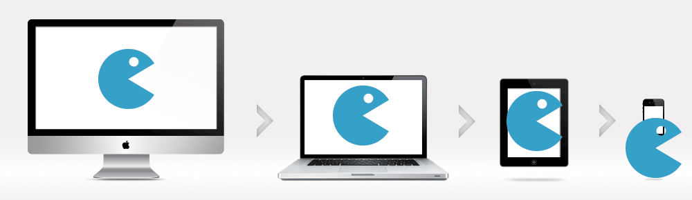
The basic idea with the top-down method of design is to create a large screen display product and then add code after code for smaller screens. In the mix of this de-evolving process, most of the time, you are overloading the smaller devices with far too information causing the smaller devices to lag at excruciatingly low speeds, if the device should load any of the information at all — imagine trying to play Halo 4 with the processing power of an Atari 2600 … not happening.
As a Compuware study notes, this is a problem when 71% of mobile users expect mobile sites to load as fast, if not faster, than that of their desktop experience to a site. The same study notes that 74% of the mobile users will abandon a site that is loading, should the page be taking any longer than five seconds.
By developing in the top-down method, you are severely limiting your incoming traffic from mobile users.
Additionally to slowed performance, by developing with desktops first, you omit the multitude of functions and features you can do with a mobile phone nowadays. With integrated GPS, phones, voice input, etc., the mobile first design allows you to take all of these capabilities and put them in your design. Though, some capabilities such as voice input and picture input are becoming more and more prevalent for desktop users, the numbers of mobile capabilities for usability seem to enumerate by the month. If you aren’t planning on staying ahead of the curve, you better plan that you’re going to be falling further behind.
The Smartness of Building from the Bottom-Up
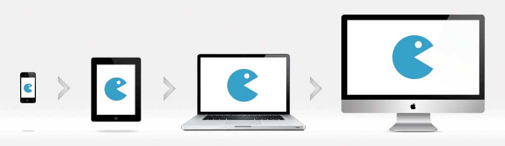
With Mobile First, we are in a process of developing adaptive, future-friendly sites. This progressive enhancement helps in keeping the content and media featured on a site from being far too heavy for the lowest-tech phones to handle. By developing with the lowest common denominator, you can keep all your users happy and navigating freely through your site without the complications from those pages that are geared for more media-heavy and larger tech-minded. Even though we start with the most simplistic core foundation of a site, to progressive add features to each level of higher tech, larger screen, etc. the process to do so is much easier.
Along with the technical positives, from a design perspective, a mobile first approach helps us develop for ease of usability. With, roughly, 80% of the screen size taken away when you start with mobile first design, you have to think about how to utilize your space in a much more conservative manner. This helps in keeping the core values you want to present to the users in the forefront without flooding with superfluous amounts of filler. Then, as you progressively enhance for larger and larger devices, screens, etc. it helps keep you focused on the core values of your site and what the user can accomplish when visiting.
By the year 2014, mobile web users will overtake fixed web access (aka desktop web access). If that statement from the people over at Smart Insight doesn’t give any jitters about the increasing need for a mobile first design, how about this one: the percentage of mobile web use increased (in just two years) in the US by 69%. If the good ol’ US-of-A percentages aren’t enough for you, let’s look at other countries’ increases in just over the two years shall we? — Europe saw an increase of 183.43% and Asia saw an increase of 192.46%. Again, keep in mind this increase was just over two years.
If you still don’t feel these trends make any sense as to why we should start adopting the mobile first design, you must not have a pulse.
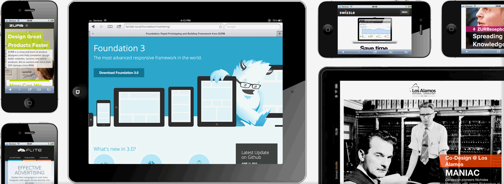
Cultivate Your Site for Mobile First
As you may already know, we at ZURB are quite proud and fond of our Foundation framework. However, we don’t have any mobile first functions with our current version. That’s why we have been meticulously brewing something new in our Foundation cauldron for the future. We’ve been only using the best ingredients: eye of newt, and toe of frog, wool of bat … you know, the best of the best. Anyhow, the future looks bright for you Foundation faithful, as we plan on including all the beautiful and glorious abilities of mobile first into our framework for your use! No more abundant information trying to compress into those feature phones, for it will load all nice and neat regardless of the tech being utilized on each and every device.
In the off-chance you may have already built separate desktop and mobile sites, fret not! By having mobile separate sites, you have the small groundwork laid to be built into the vast structure of forward progression known as Mobile First. Mobile first is here and we are ready to make it better and easier for us all as users or designers.
Let’s stop trying to compress large amounts of information from the top-tiered tech devices into the lowest of the low tech devices. Let’s let our end-users get stuff done by developing with the mobile first design.
And before you put your mobile first design out into the wild, give it a test run in Helio with this test template.
Mobile Navigation Test
Bolster your mobile navigation with a test that checks for ease of use, UI comprehension, and customer experience in one easy to use template.
Use this template for:
- Product Design
- See where users get lost on mobile
- Plan better for future iterations of your design