
Legibility
Polish communication with typographic clarity.
![]() eric . 5 min read
eric . 5 min read
The nuts and bolts: The ease with which a reader can decode symbols is known as legibility. In design, legibility is typically separated from readability, which is when a reader can follow and understand words, phrases, and paragraphs.
We strive for clear communication in our work: Interfaces that are easy to understand, designs that send unambiguous messages. Few things get into the nitty-gritty of communication than legibility. It’s all in the details.
Legibility is a measure of how easy a glyph — individual characters like letters, numbers, punctuation and small icons — are to read. Unlike readability, which discusses how easily users’ eyes skim across a series of shapes, legibility is a measure of how easily readers can make out an individual character.
Good legibility makes visual information frictionless. Users get it without having to think. If something is slightly illegible, though, users may pause. Even a slice of a second interferes with the message. The effect is akin to radio static. The message gets through, but if users must take time to absorb what’s being said, the design has a problem.
You can have legibility problems and still be understood. That makes it dangerous — it’s easy to say “good enough.”
Techniques to Improve legibility
We prefer to not settle for “good enough.” But how do designers do better? We use different techniques to make text easy to understand by choosing type families that are:
- Clear: Silhouettes of each letter should be distinct from the next.
- Uncomplicated: Our type family of choice, Proxima Nova, is almost geometric and devoid of excess frills.
- Has open negative space: Cuts, dimples, counters and other bits of negative space in shapes tend to get gummed up.
- Has enough leading (line height): The longer a line of text is, the more it will benefit from space between lines.
- Good kerning: Equal amounts of space between letters.

Above: This example of (extremely) bad kerning shows how the space around letters makes a world of difference. Please, think of the yeti.
A lot of good legibility comes down to size and background. Both are easy to ignore and to fix. But you have to look closely — when it comes to details meant to go unnoticed, we’re talking subtle.
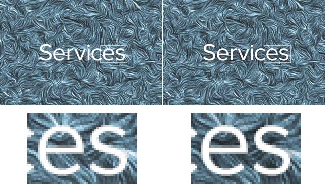
Outer shading: Contrast is key when making characters clear. When placed over a textured or photo-based background, add a shadow that emphasizes the difference between text and background. In the example above, white wisps appear to grow out of the text. A cool effect up close, but anything that seems to alter the edge of characters also degrades legibility. A slight dark shadow dims bright pixels adjacent to the letters. Result: The texture doesn’t interfere with the text.

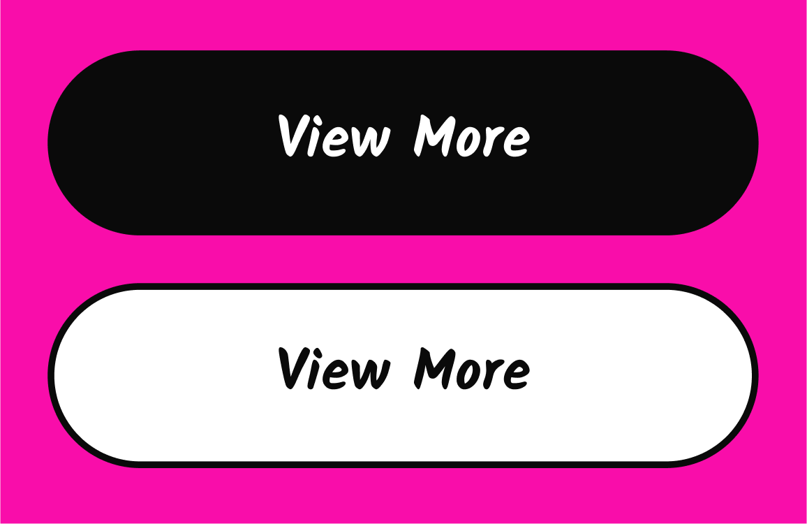
Outer glows should work with the background. The opposite of shadows holds true when dark text rests on a light background. The rule of thumb is to make the shadow emphasize the background. Above, the same text on different backgrounds loses clarity when its edges emphasize the text’s color, and gains clarity when the edges match the background. The rules of thumb:
- Light text on a dark background: Dark shadow
- Dark text on a light background: Light shadow
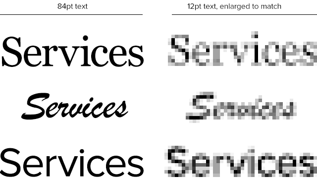
The smaller the text will run, the fewer details its typeface should have. Serifs may give typefaces unique traits, but extra decorations just gum up the words at small sizes. In the graphic above, samples of 12pt text are enlarged next to show lost legibility. Just how much they lose becomes apparent when compared to full-size samples. Chock full of fine details, the script typeface becomes an illegible blob.
Our Methods to Check Legibility
We created several tools that test legibility, both of which you can use to improve your design work.
- Clue: Check how legible text is by testing how much people can read and remember in a few seconds. The more they recall, the more they were able to read — a real-world measure of legibility.
- Spur: How well does a design work under adverse conditions? The more a site can be degraded and still be readable, the better its legibility.
- Helio: Do your users comprehend your UI? If users can’t understand your design… then what hope do they have to use it? Use this template to help you out:
UI Comprehension Test
Take the ambiguity out of your user’s actions. Your users need a clear, easy-to use UI to achieve their goals without being overcome with frustration.
Use this template for:
- Product Design
- Choose between UI variations by determining the best fit for real users
- Improve usability of your design by removing ambiguity from your UI
But most of all, we just stand back and ask ourselves, how easy is this to absorb? Is the text sharp enough to read at a distance? Does it flow, or do letters seem to clog up? Can we tell lowercase “o” from bullet points?
Answering these little questions are that extra polish that quality work requires. As a medium of communication, good design makes text easy to understand, from the big picture to the tiny details. Legibility is one of those details that’s easy to overlook — they’re tiny, and people rarely complain about it. But anything that helps improve communication also makes a good product better. Details matter.