Information Architecture
Goal-centric structures trump old-fashioned charts.
 Morgan McGowan . 5 min read
The nuts and bolts: Information architecture is the craft of organizing and labeling websites, intranets, online communities, and software to improve usability and findability. It’s a burgeoning community of practice dedicated to integrating design, architecture, and information science ideas into the digital realm.
Site maps rarely find use outside of meetings between clients and designers. They organize pages into structures that look fine on paper, but we’ve never found them useful to end-users. That’s why we use information architecture to define workflows, not to categorize pages.
Successful websites are organized to help users achieve a goal — either theirs or the site owners. We use workflows to help us define site structure rather than traditional static site maps. The idea is to base the site structure around how we want users to experience the site.
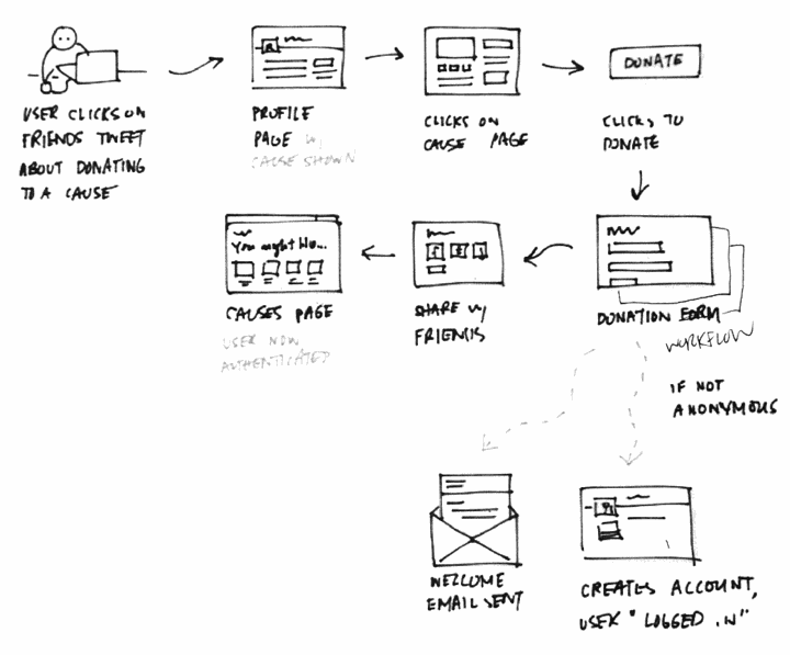
We create site workflows by asking, “who’s looking at their marketing site, and what are they trying to do?” Diagrams like the one below show what steps users might take to reach a goal. Sometimes the steps — like “donate” below — aren’t pages. It’s not about arranging pages. It’s about defining paths for users.
Different Users Have Different Goals
Of course, users can click anywhere in a site. We can’t control where they go. But we can persuade them. When we say “path for users” we mean “paths of least resistance” — the links they’re most likely to take by design.
Just as smart designers know there are many kinds of users, smart websites provide more than one possible path for users to follow. Creating those paths depends on users’ motivations. Why are users likely to visit a site? Figure that out and you can start to guide them to a goal. Luckily many users fall into a few categories based on what they want.
“Solve My Problem”
Hunters came to the site already motivated to act. These are the users who visit favorite blogs on a regular basis, or who’ve decided to sign up/buy beforehand. Their workflow is the shortest route to that action.
It’s easy to assume large “sign up” or “buy now” buttons are all these users need. But we shouldn’t ignore follow-through. For one thing, users who know their goals have expectations. Good design will explain exactly what the user will get with text, imagery, video, or other media. It will balance minimizing users’ effort with offering the right options. It will follow up with a thoughtful thank-you page. The site may send a confirmation email or other follow-up message. Above all, it will work fast. Boom. Done.
“Pique My Interest”
On the other hand, casual browsers don’t necessarily know (or care) about the business behind the site. They’re just curious. Maybe someone sent them a link, or they saw an interesting ad. These fickle users are likely to wander away — but they’re also susceptible to subtle design hints. Blatant calls to action that attract hunters are “look somewhere else” signs to browsers.
Good architecture leads casual users along a series of steps designed to hold their attention. Each step is often a page, but not always. They’re a series of events that occur as we lead users to concrete goals.
All Paths Lead to a Goal
Wait — what’s a goal?
For many clients, that goal is a sale. Others want to collect email addresses, or maybe to educate users about a cause. Some sites have many goals. Our work with Darby Smart, for example, centered on selling fashion kits to customers. But we also wanted to attract fashion designers. The latter needed to answer “what’s in it for me?” Even then we designed for both users who were ready to sign up, and users who clicked out of curiosity.
The site’s architecture plan called for both. Deciding to make that one page with a modal instead of two pages was a design detail. Thinking this way helps us see the architecture behind a website anew. It’s not about how pages are arranged. It’s about how we guide users to an end that serves both them and our client. It’s less “map,” more “timeline” — less about the site, more about the users.
Put Your Architecture to the Test
Helio lets you test whether your architecture works. Take your mobile navigation for a test spin around the galaxy with this test template.
Mobile Navigation Test
Bolster your mobile navigation with a test that checks for ease of use, UI comprehension, and customer experience in one easy to use template.
Use this template for:
- Product Design
- See if your users can actual get around on mobile
- Plan for navigational updates with ease