Em Space
A responsive unit of measurement for elements at a given point size.
 The Helio Team . 5 min read
The nuts and bolts: An em space is a typographical space with a width of one em. An em spacing is traditionally the width of a capital letter M in a typeface that employs the Latin alphabet. An em spacing is frequently smaller than a capital M in current digital typography, which strives to standardize measures for different languages and alphabets.
Pixels, points or ems. The trifecta of confusion amongst most designers. How do you decide on which measurement to use? Well, let us help dispel some questions you may have, and make it easier for you to decide in the future. First, let us start with, ems. This variation of measurement actually encompasses both pixels and points, since CSS often calculates the default font size — whether it be 18pt or 18px — as 1 em. How does this make an em a preferable choice?
The Changing of Em
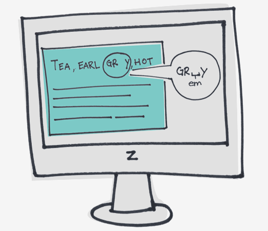
As most would guess from its phonetic sound, the term em is related to the letter M. The relation comes from the original definition, which was a result of the width of the letter M in a given typeface. This was because M would originally take up with the entire block in block printing methods.
Today, the term em does not specifically hold onto its print roots, it is now specific to all digital spaces. Em is relevant to specific point typeface sizes — one em in an 18 point font would be equal to 18 points.
Ems, outside of their typographical interpretation, can be relatively hard to define seeing as how the concept of em is actually rather arbitrary and quite abstract. So, if em spaces are abstract and part of the technical typographic lexicon, why does it matter to us as designers?
Em & Em’s: Responsively Delicious
Just as modular scale is a handy tool for the new responsive landscape of the web, ems are just as useful in crafting responsive content. Here are a few concepts associated with ems that help in doing so.
ems are just as useful in crafting responsive content — the relative unit of em is important for scaling elements, much more so than the fixed measurements of pixels. Thus, lending more affirmation to the use of ems over pixels and points.
- Ems help in scaling content. The unit of em is not a static unit like pixels. This affirms the usage of ems over the unit of pixels.
- The em can be used to help set up guidelines and rules for elements (as well as other characteristics) of your site.
Again, like modular scale, these concepts help create consistency throughout your designs.
One way in which ems can be useful in scaling your elements is by setting the height of container elements in the unit of em. By doing so, if users should change the font size in browsers, the container element will adjust accordingly to variations of size and not break the design you’ve created.
Em and CSS, Hand-in-Hand
With CSS, most browsers have a default font size of 16px. Just as ems are relative to point size, in CSS, the ems follow the same rule of the pixel sizes — in this case, 16px is relative to 1em. The linking of these two rules helps keep the content flexible and responsive within the framework of the site. When users access content on multiple devices, by setting the max-width and height in terms of em, you help keep synchronicity and harmony of content throughout your site design.
One thing to keep in mind with ems, is that, along with their already abstract definition, is that they are relative to their sole parent element. This creates problems when you are setting multiple font-sizes, as it often messesoften times messes with the em relation to its parent element, the default font size. Because of this small fact, ems can be quite cumbersome and frustrating when dealing with multiple sizings found within code.
“Check Out My 28 Inch R[e]ms, Brah!”
Well, seeing as how we found a slight problem with ems and sizing, thank goodness there are rems to help in creating more uniform, less cluttered code for sizing our content and elements.
Rems are similar to ems in that they are relative units. However, because ems are relative to parent elements, it creates a compounding issue. Whereas with Rems, we are dealing with a unit that is relative to the root HTML element. Hence rem – root em.
To quote an article by Cameron Chapman:
“They work in an almost identical way, except for one key difference: rem units are relative to the html element, rather than individual parent elements. This makes maintaining proper sizing of your type much more straightforward.”
This helps in creating more harmony with your layout and content design.
To get an idea of how rem’s are utilized within coding, you have to remember since you’re dealing with HTML rather than individual elements, you need to set your HTML font to 100%, from there, again from Chapman’s article, an example of your CSS code using REM will look similar to this:
Take Em Out Tonight
There have been many disputes over whether to use pixels, points or ems when designing pages —– lets keep in mind that pixels are dead, as far as ZURB is concerned (hence, we use percentages), in terms of how they relate to the future of the web and responsive design.
However, seeing as how both pixels and points are both attached to ems in CSS, it makes sense to keep ems in the forefront of your mindset when designing.
A reason to choose ems over pt. or px. is the fact that ems are scalable while the others are fixed-size units. The fact that ems in nature can enlarge, downsize — enough to be mobile-friendly — helps the case to use ems over px. and pt. Scalable units help with our responsive designs.
We need to keep in mind, that ems aren’t the end-all be-all of measurable units. They are, however, more useful than most others. Ems are another tool that you can add to your design toolbox that can come in handy when you need them the most.
You can test your Ems and their balance with the whitespace on the page with Helio. Check out our Whitespace Opportunities Test:

Whitespace Opportunities Test
Dig into your target audience’s needs to discover the unknown and take advantage of new whitespace opportunities.
Use this template for:
- Product Development
- Learning your audience’s needs allows you to expand your platforms in ways that increase user engagement
- Quickly brainstorm through ideas and bring data to the table to validate a direction for your team