Contrast
Opposites attract the attention of your users.
![]() Morgan McGowan . 5 min read
Morgan McGowan . 5 min read
The nuts and bolts: Contrast can be defined as a difference between two or more elements in a composition in the context of visual design. The greater the difference between the elements, the easier it is to compare and understand them, and this is when they are said to have contrasted.
When building a proper design for your site, it’s important to cover the hierarchy of content and how you plan on presenting your content to your users. What is it about the hierarchy that really pops out to your user base? It’s quite simple actually. It’s a contrast.
By contrasting elements of your design, you are creating visual interest to your page. You are separating important takeaways from the supporting material. Without contrast, you have a bland composition – think tofu out of the container, no special preparations, and no garnishes. Without ample contrast – visually stimulating design – you are just serving bland tofu to your users. How many users want to return for more of the same insipid offerings? Zero.
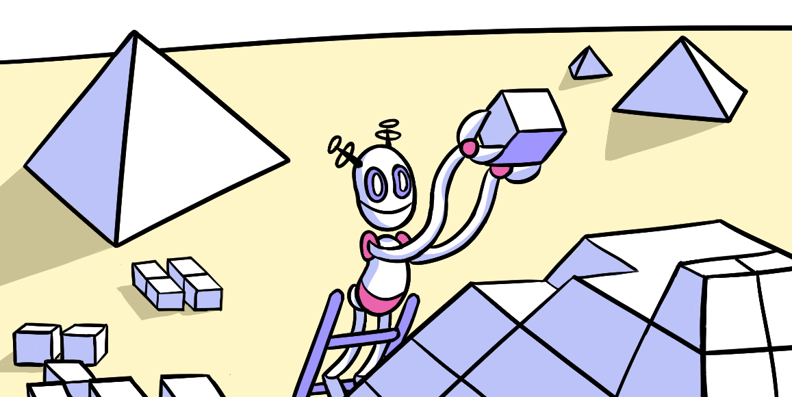
Contrast can be achieved through many stylistic choices, though we will touch on a few of the more common aspects, as there are many ways to achieve contrast. Most of these forms of contrast parallel the ways in which we achieve visual weight. These forms are: size, color, texture, shape, and orientation.
You want to create contrast for your products because contrast creates impact.
Bulk It Up
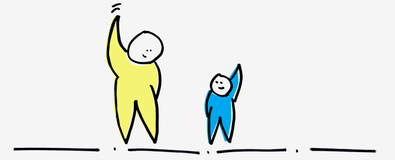
An easy way to create contrast is by messing with the sizing of elements. If you put large text in a predominantly small text field, the large text will undoubtedly stick out and harness much of the user’s attention.
Contrast through sizing can be done simply by bolding text. This is an easier way for a user to understand what is important to them to pay attention to. This helps those users in a hurry. Skimming through the content they can still understand what’s important within the design.
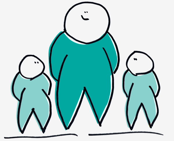
Whether it’s by adding height, girth, or just bulking an element, you can create a size contrast that your users are sure to devour.
Against the Texture Grain
One way to punctuate a layout on your page is through the usage of textures. A texture can add some spice to the recipe of success for your page. One way that you can really satiate the users’ needs of your product is by contrasting the texture with another texture.
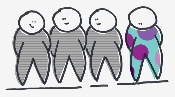
For example, you can use one texture that is completely different from your overall layout to really draw in users’ attention to a call to action.
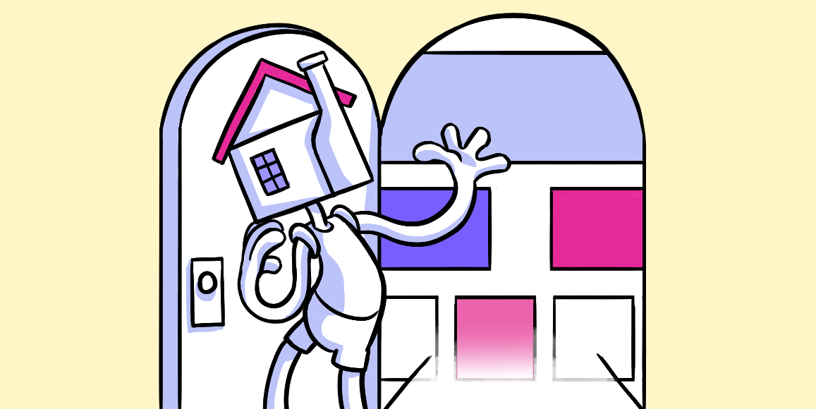
Pairing Color and Design
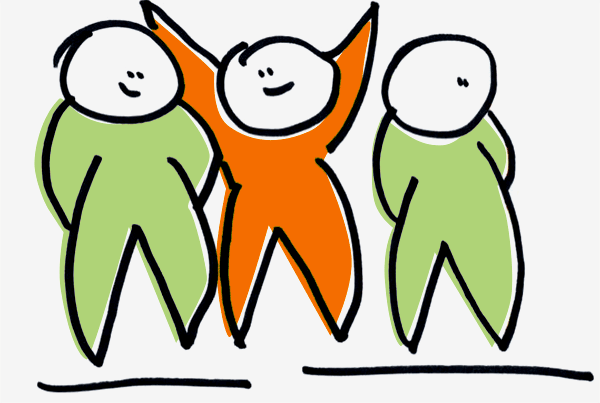
One way in which you can really serve up a spicy offering to your users is by adding some color contrasts.
When dealing with colors in your design, it can be quite tricky to achieve contrast as it can be quite subjective as to what colors really contrast against one another. Certain color contrasts can be extremely distracting and hard on the eyes over other variations of contrast. With the varying tints, hues, shades, and saturations associated with colors it can be cumbersome to create that beautiful and enticing contrast for your users.
But worry not, there are some tools that have been created to help you implement the best color contrast, such as Colour Contrast Check. This helps you analyze whether or not someone with color blindness would be able to view your site’s elements without trouble.
This is beneficial because if the contrast does not allow those with color sight deficiencies spot them, then the contrast may not even work for those who can see the colors that you have presented.
Get In Shape
You can really get your users salivating by changing the shape and look of your product. Too many similar shapes and alignment causes conflict. You want contrast. Changing the shape of an element can create great contrast.
Think about a body of content. If the whole body of text were written in the same typeface with no variance, it would be hard to find the importance of the message. However, if the typeface should have some variances, it would allow the user to easily find the takeaways and really grasp the message.
Stick Out from the Crowd
Our last suggestion to really pack a punch for your user is adjusting the way in which elements are oriented on your layout.
On a page with straight-line text and elements all placed in a structured manner, all it takes is one element placed with an offsetting angle to really punch up your product with some. The orientation of your contrasting element doesn’t necessarily have to be at an angle to create the contrast, as long as the element is disoriented from a similar manner as all the other surrounding elements, you are sure to have created contrast.
Contrast-ually Active
We like to play around. We like to play around A LOT. In fact, You will find several instances of contrast throughout the ZURB site. Go ahead, bounce around and see the ways we like to play with contrast to pull you in as readers and users of our stuff. But if you’d prefer we bring you a scrumptious offering of our contrast on a silver platter … well then … Without further ado, here is how we handled some contrast for our ZURBsoapbox page.
Be the Contrast You Wish to See in Life
One thing you must be cautious when designing for contrast is to not overload. Too much contrast negates the reasoning behind contrast. With too much contrast your site regresses back to a state of similarity. You want to keep your contrast sparse. You want the contrast to be meaningful.
When you are creating contrast, you want to be creating it for a reason. Make sure you have a user need or business goal in mind when creating these contrasts, rather than just pure aesthetic reasons. You want the contrast to help in accomplishing those goals and needs.
You want your contrast to motivate your users. The contrast creates impact. You want to satisfy the user’s hunger. You want to give the users meaningful and hearty design. Not lifeless tofu design.