
Product Design Lessons
Responsive Email Design | Lesson #93
Get Your Responsive Emails in Order
Learn how to source order columns in responsive emails.
Ah, responsive email design — the art of stacking the thing on the left on top of the thing on the right for smaller screens. While this is a powerful concept in the world responsive emails, designers may sometimes want to, dare we say, stack the thing on the right on top of the thing on the left. Today we’ll explore the concept of source ordering using Ink and and the power of table-based emails.
1. Sketch it Up!
First things first, you need to know what it is you’re trying to build! Start sketching how your email is laid out on desktop and mobile. These should be quick and dirty and look something like this:

2. Create our content.
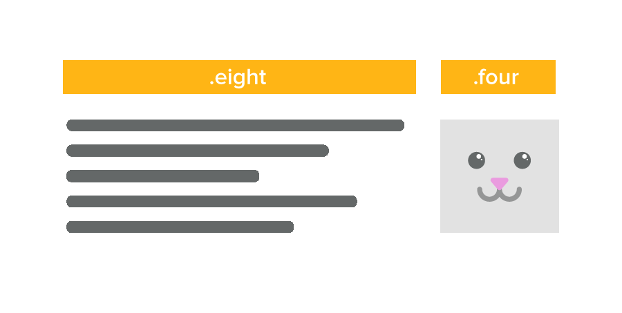
If you look at the sketch from step one, we want to take the image on the left and move it underneath the text when it's viewed on mobile devices. We’ll first code lay this out into two `.columns` tables in our responsive email framework, Ink. We’ll go ahead and choose “.four” and “.eight” for the two classes.The meat of the code will look something like this:
<table class="row">
  <tr>

    <td class="wrapper">

      <table class="eight columns">
        <tr>
          <td>
            <p>Lorem ipsum dolor sit amet, beatae deserunt!</p>
          </td>
          <td class="expander"></td>
        </tr>
      </table>

    </td>

    <td class="wrapper last">

      <table class="four columns" >
        <tr>
         <td class="center" align="center">
           <center>
             <img class="center" src="http://placekitten.com/g/600/600"
             width="128" height="154" alt="Majestic Kitty" />
           </center>
         </td>
          <td class="expander"></td>
        </tr>
      </table>

    </td>

  </tr>
</table>
3. RTL and LTR to the Rescue!
Let’s add the dir=”rtl” attribute to the table.row. This causes the client to render all of the <td> elements from right to left as it reads through the DOM. This also applies to the text inside of each of the <td> elements. To fix this, we’ll add the dir=”ltr” to the child <td> elements so the text renders correctly. Check out the code below:
<table class="row" dir="rtl">
  <tr>

    <td class="wrapper last" dir="ltr">

      <table class="eight columns">
        <tr>
          <td>
            <p>Lorem ipsum dolor sit amet, beatae deserunt!</p>
          </td>
          <td class="expander"></td>
        </tr>
      </table>

    </td>

    <td class="wrapper" dir="ltr">

      <table class="four columns" >
        <tr>
         <td class="center" align="center">
           <center>
             <img class="center" src="http://placekitten.com/g/600/600"
             width="128" height="154" alt="Majestic Kitty" />
           </center>
         </td>
          <td class="expander"></td>
        </tr>
      </table>

    </td>

  </tr>
</table>

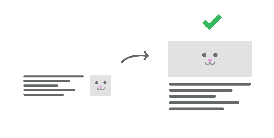
4. Reorder that markup.
Because we’re changing the order of how the table is rendered, it’s actually the opposite of what we want to do! Remember, we want the text on the left, and image on the right on larger screens, and image on top for smaller screens. We’ll go ahead and switch the order of the image and text in the markup like this:
<table class="row" dir="rtl">
  <tr>

    <td class="wrapper" dir="ltr">

      <table class="four columns" >
        <tr>
         <td class="center" align="center">
           <center>
             <img class="center" src="http://placekitten.com/g/600/600"
             width="128" height="154" alt="Majestic Kitty" />
           </center>
         </td>
          <td class="expander"></td>
        </tr>
      </table>

    </td>

    <td class="wrapper last" dir="ltr">

      <table class="eight columns">
        <tr>
          <td>
            <p>Lorem ipsum dolor sit amet, beatae deserunt!</p>
          </td>
          <td class="expander"></td>
        </tr>
      </table>

    </td>

  </tr>
</table>
The image should now start off on the right on a large screen and then move on top of the content on the right! Check it out! Pretty cool huh?
Next Steps
That’s it! No longer are you confined to the paradigm of placing left thing over right thing for mobile screens. You can now wield the power of source ordering with just a few attributes inserted into your markup!
Check out the code and demo on Building Blocks here: Building Blocks ➥
About the instructor

A code and design ninja, Tim Hartwick is a designer who loves a challenge and enjoys teaching people. Tim has designed apps, websites, and is great at solving problems.
Product Design Lessons, Direct to Your Inbox
We're just getting started, so sign up and we'll keep you in the know with our product design lessons. No spam here.